Area23
User Centered Design for Healthcare
Brands I collaborated with


What I did?
I redesigned tools for improved usability, created interactive assets to align stakeholders, and empower sales reps with UX solutions. I provided UX recommendations for virtual experiences, collaborated with third-party developers on technical requirements, and designed digital strategies to engage healthcare professionals, driving memorable experiences and customer engagement.
SHINGRIX – Redesigning the COVID planning tool
The Singrix sales representatives were struggling with a difficult-to-use Covid planning tool, wasting precious time as they tried to provide the right solutions to healthcare professionals. Given the time-sensitive nature of these interactions, it was crucial to streamline the tool to help sales reps work faster.
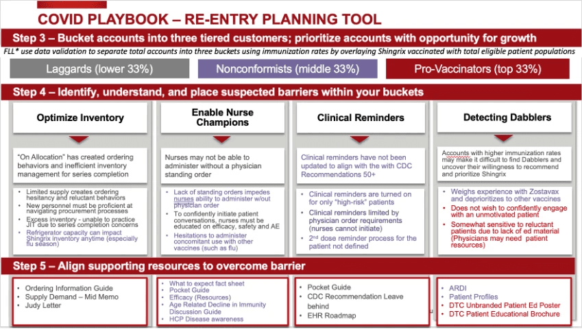
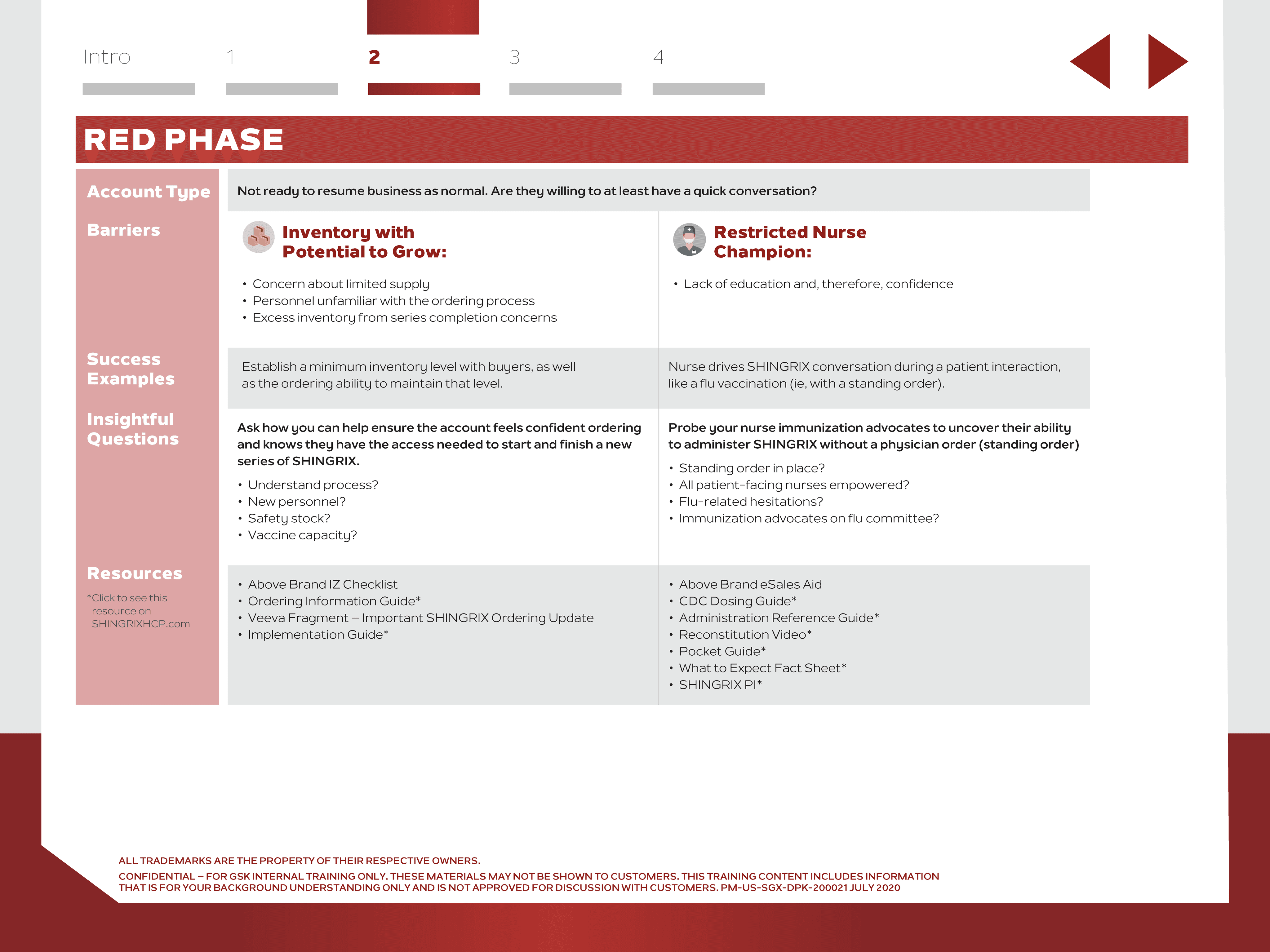
A page from the original planning tool
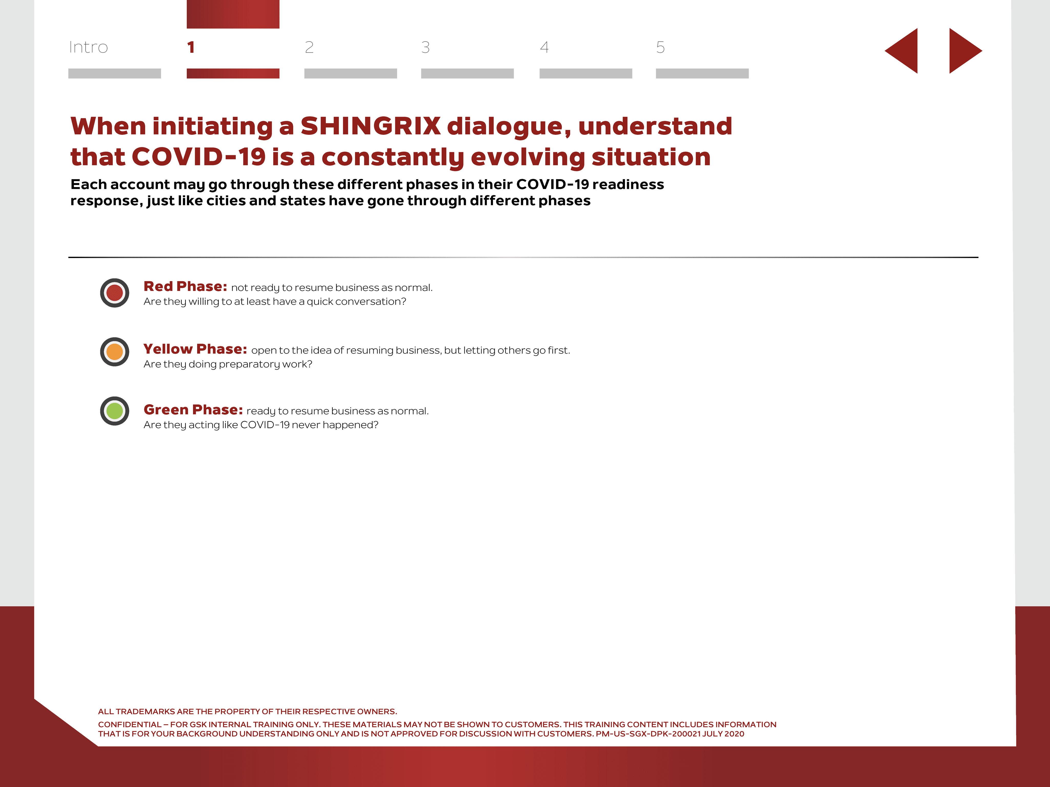
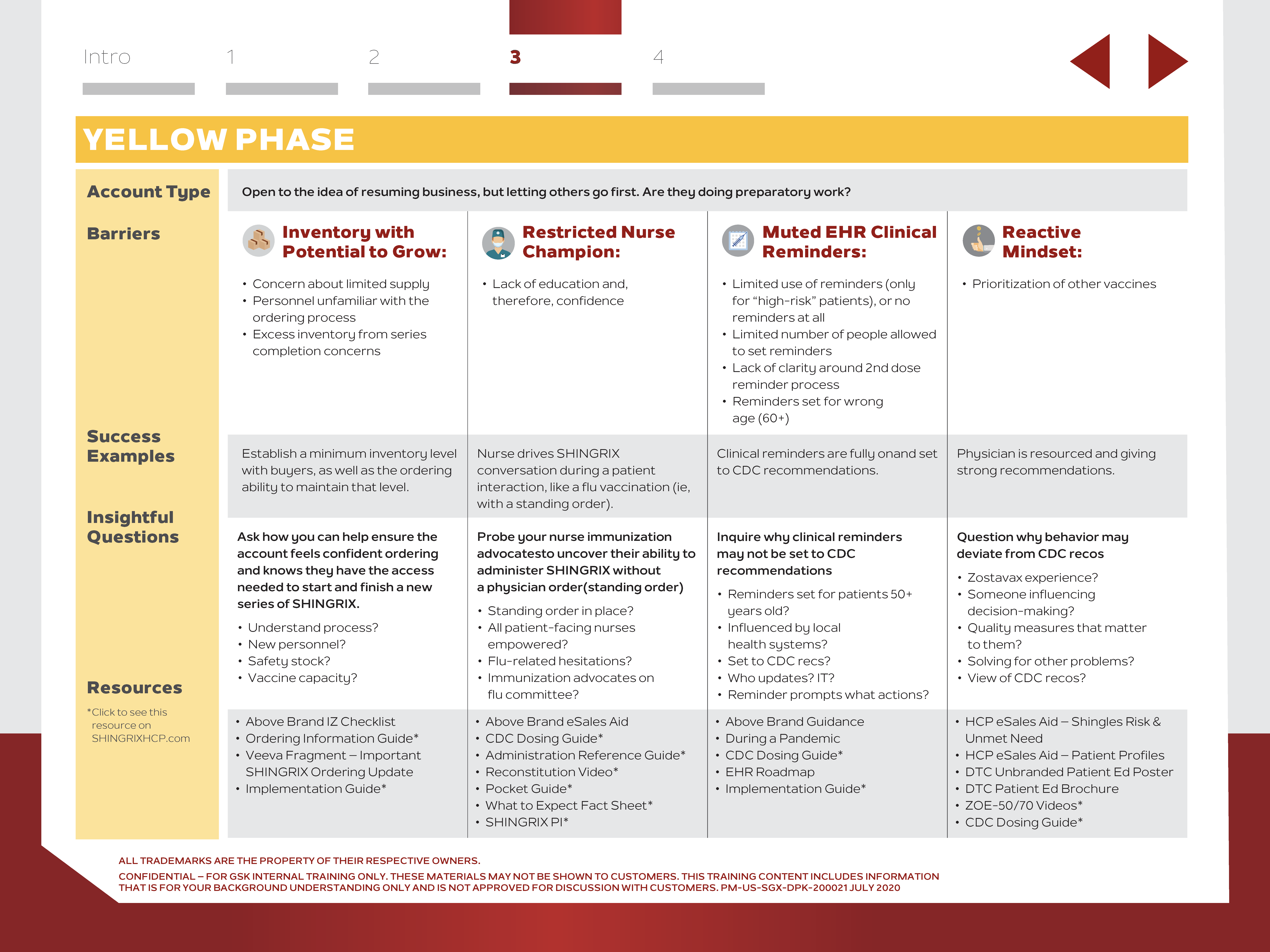
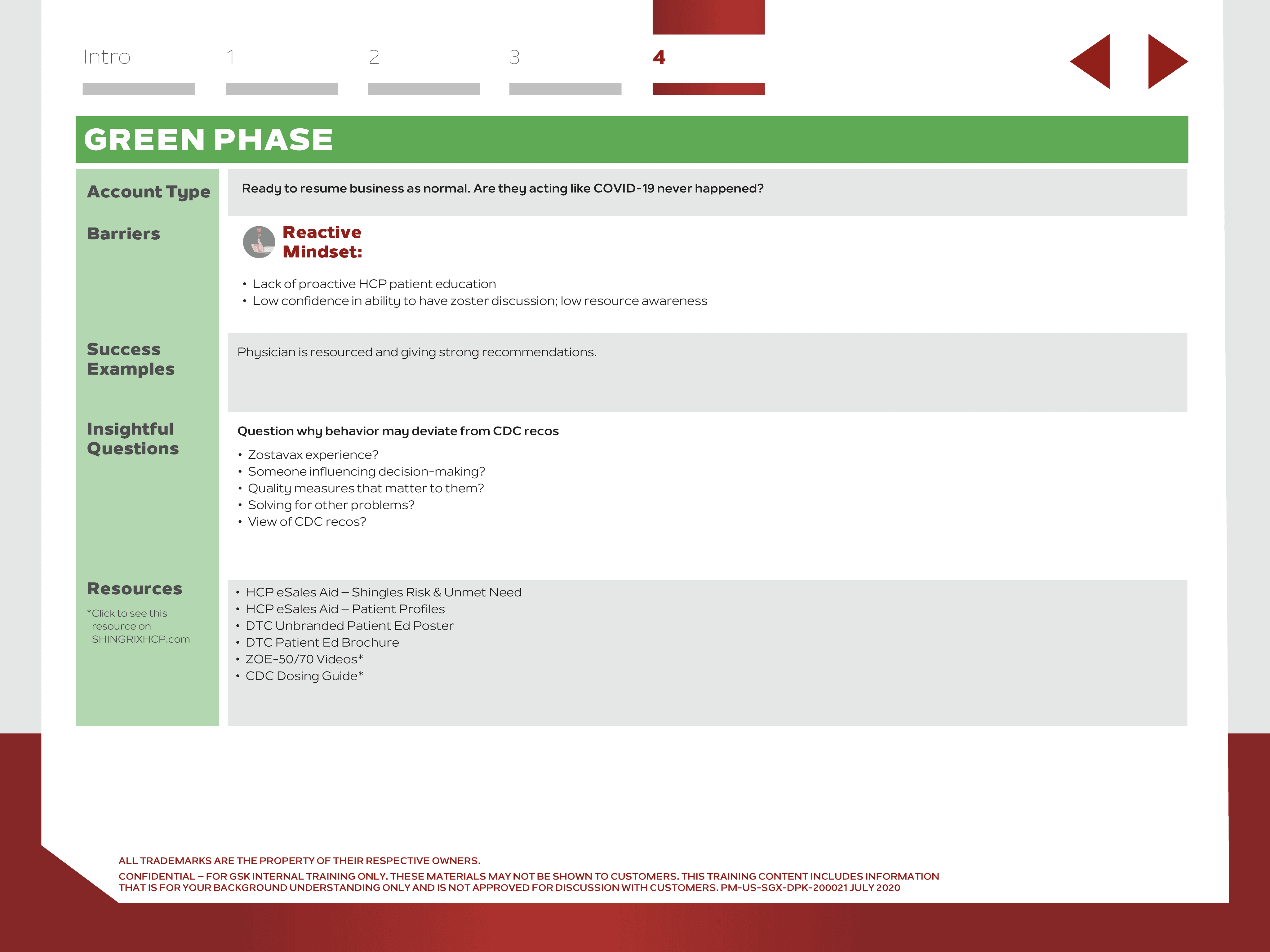
I redesigned the COVID planning tool to help sales representatives quickly achieve the following goals:
Identify key account types
Recognize barriers these customers face
Use the planning tool to provide them with the right resources
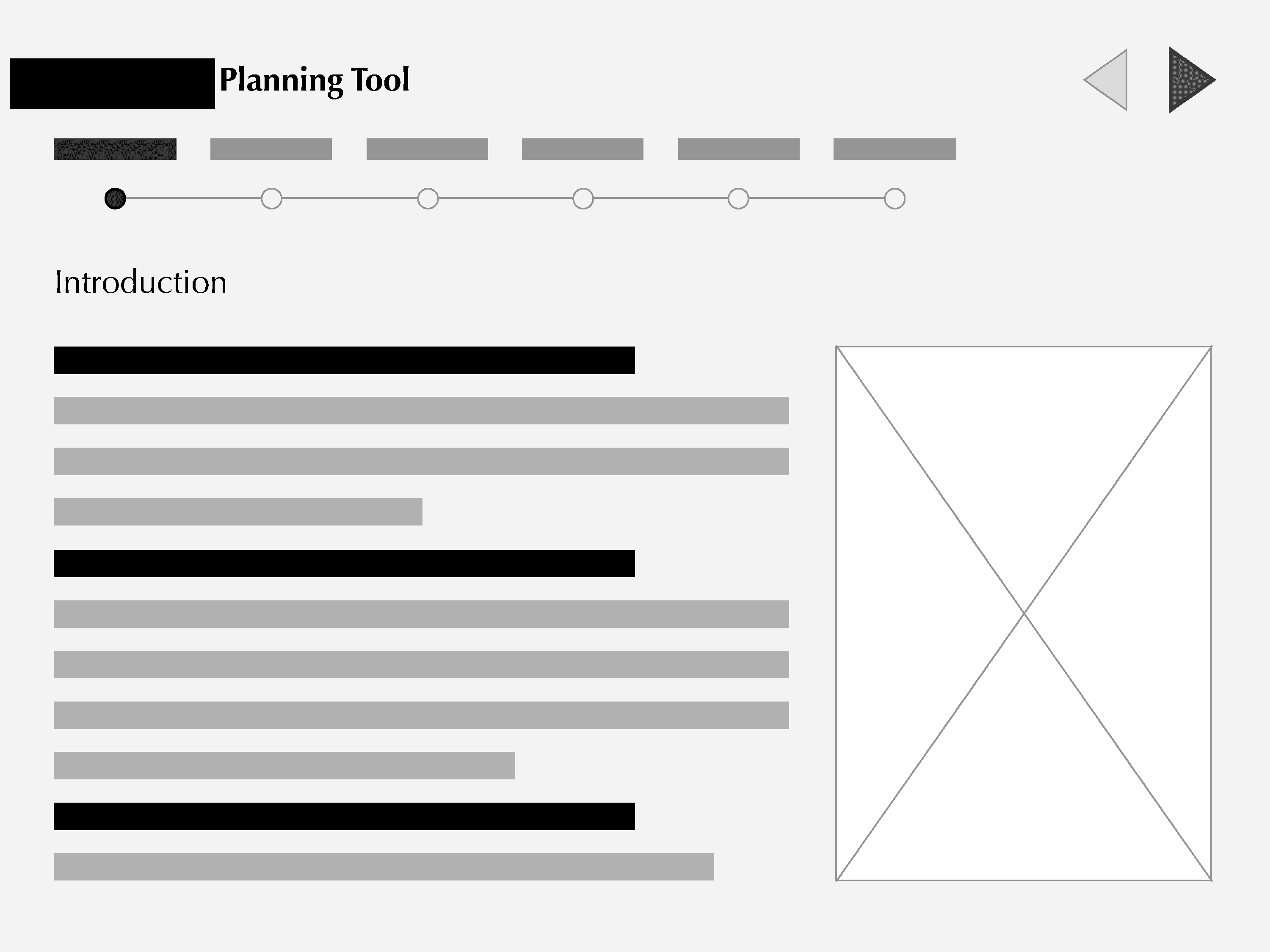
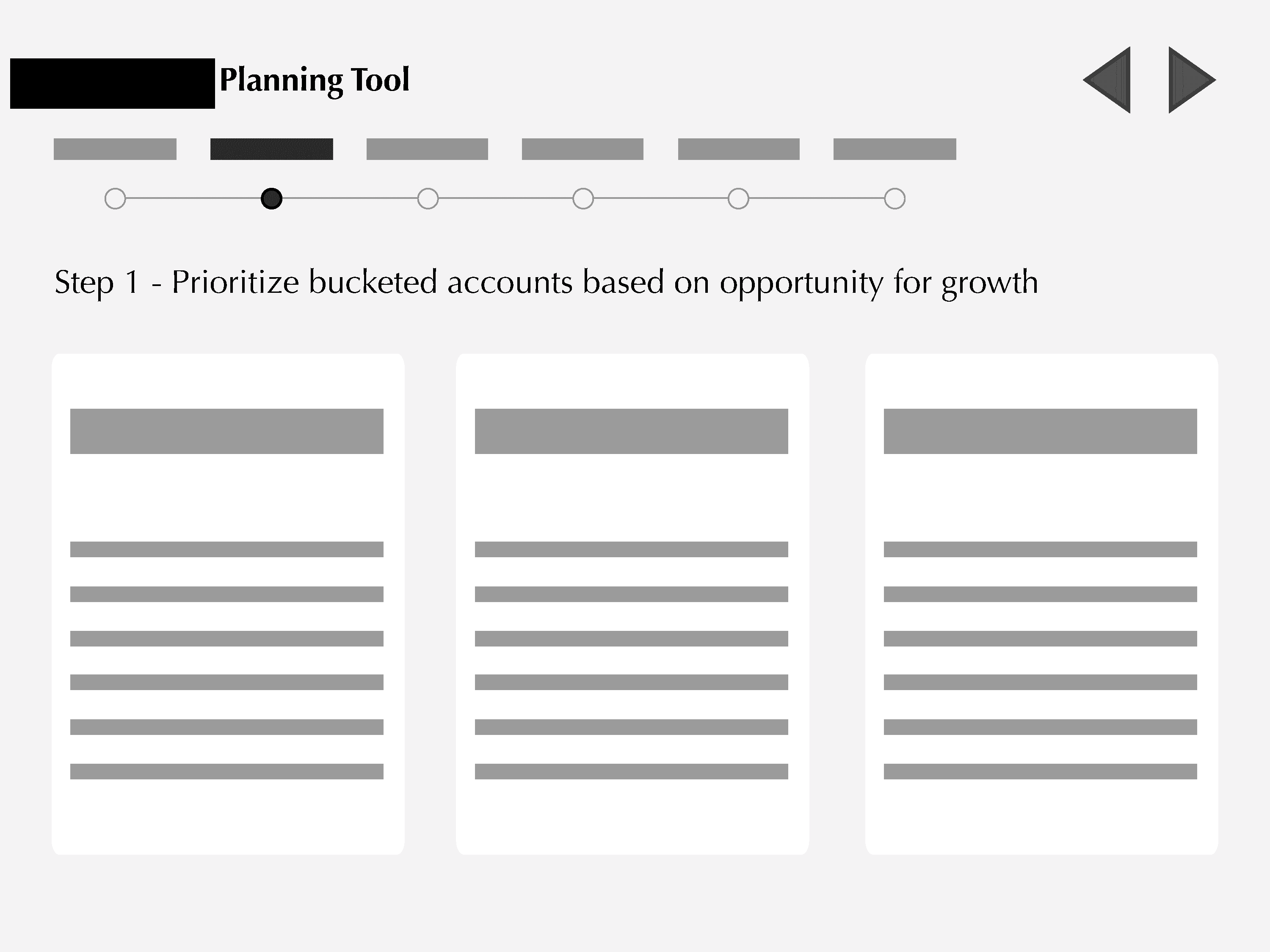
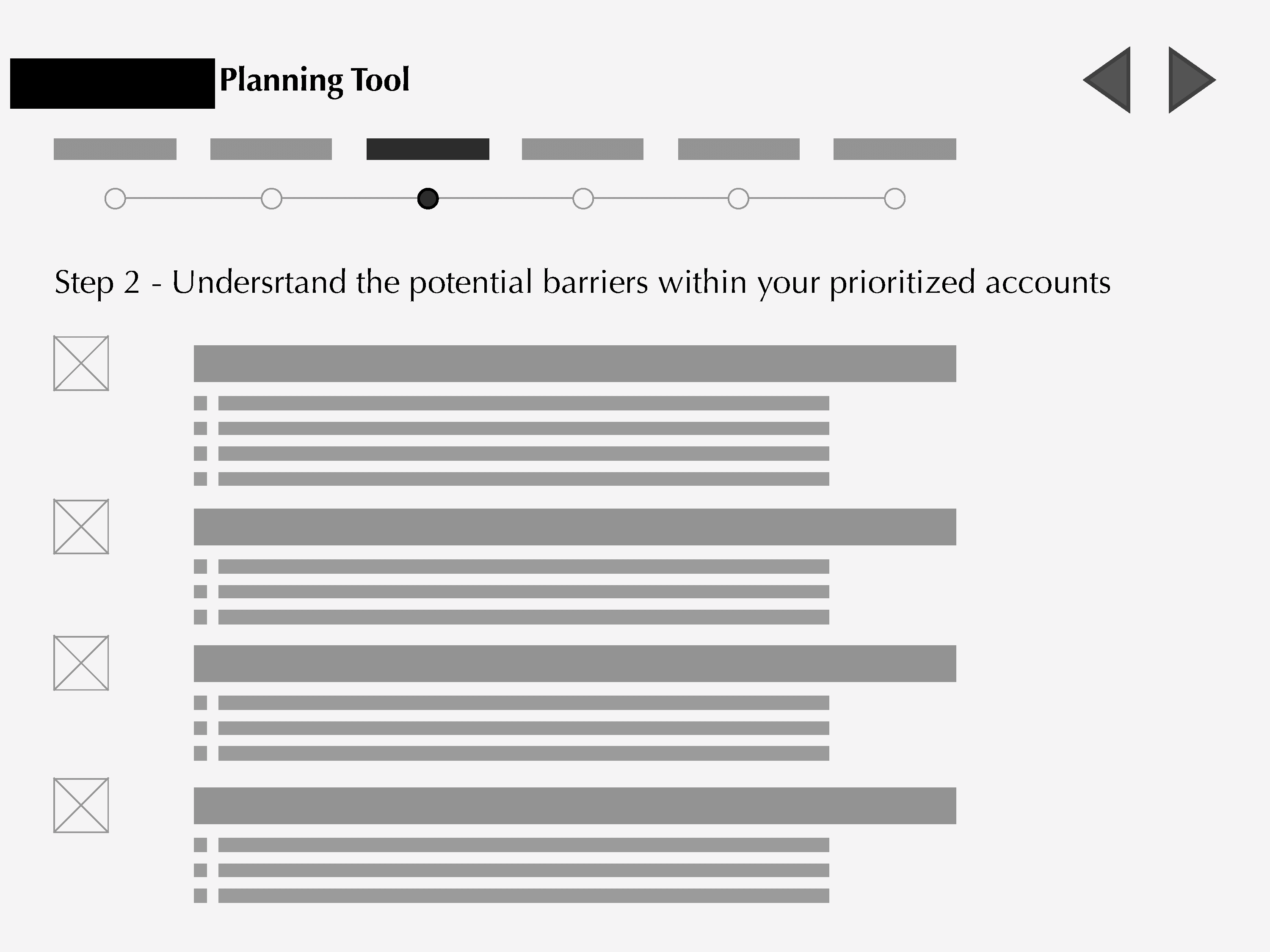
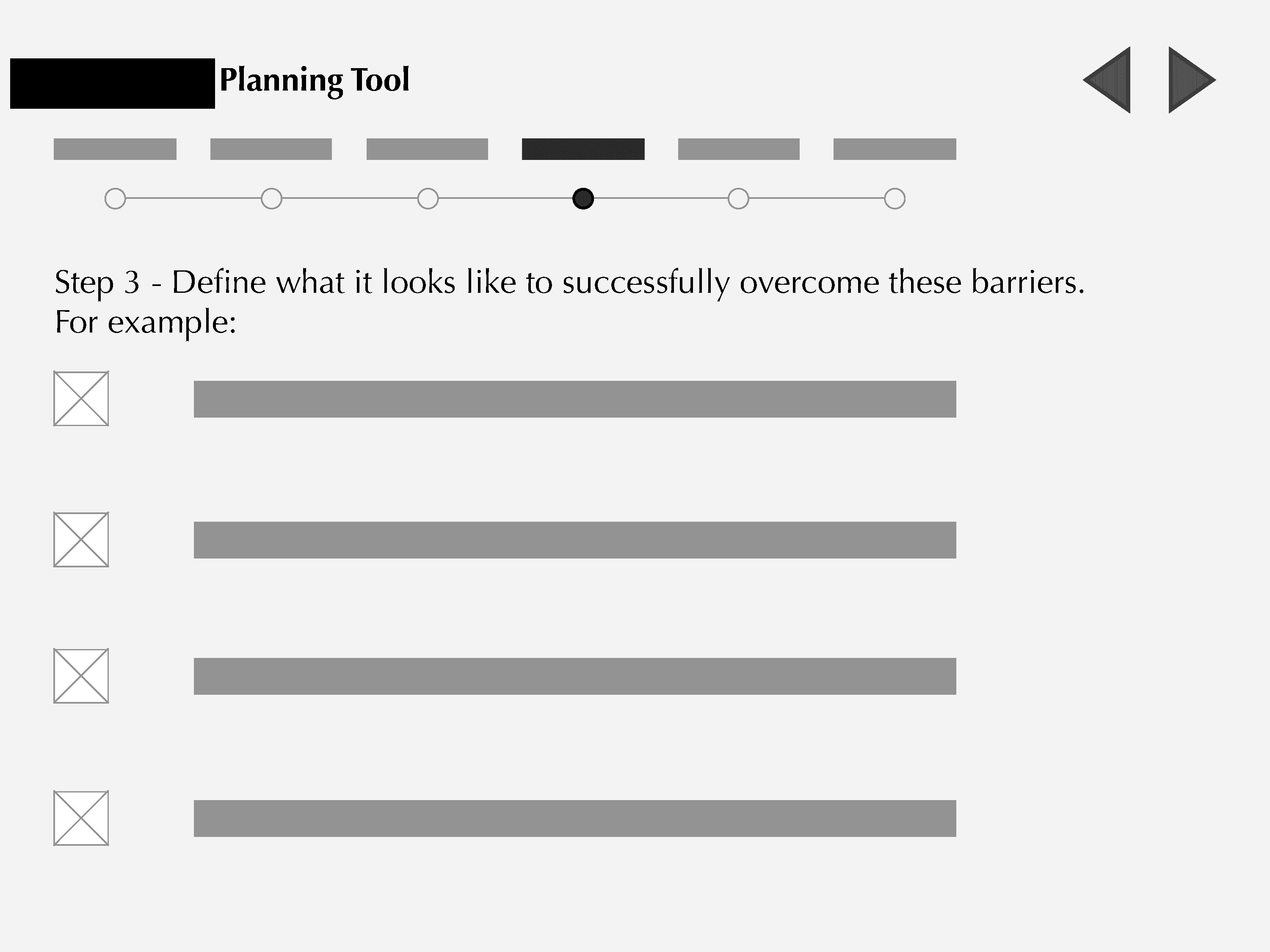
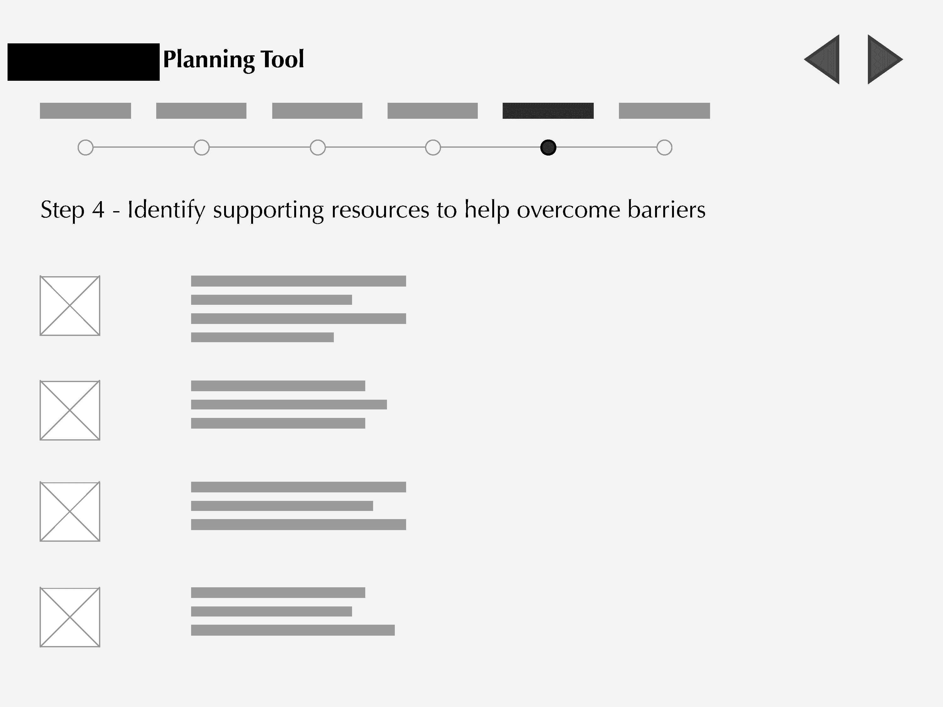
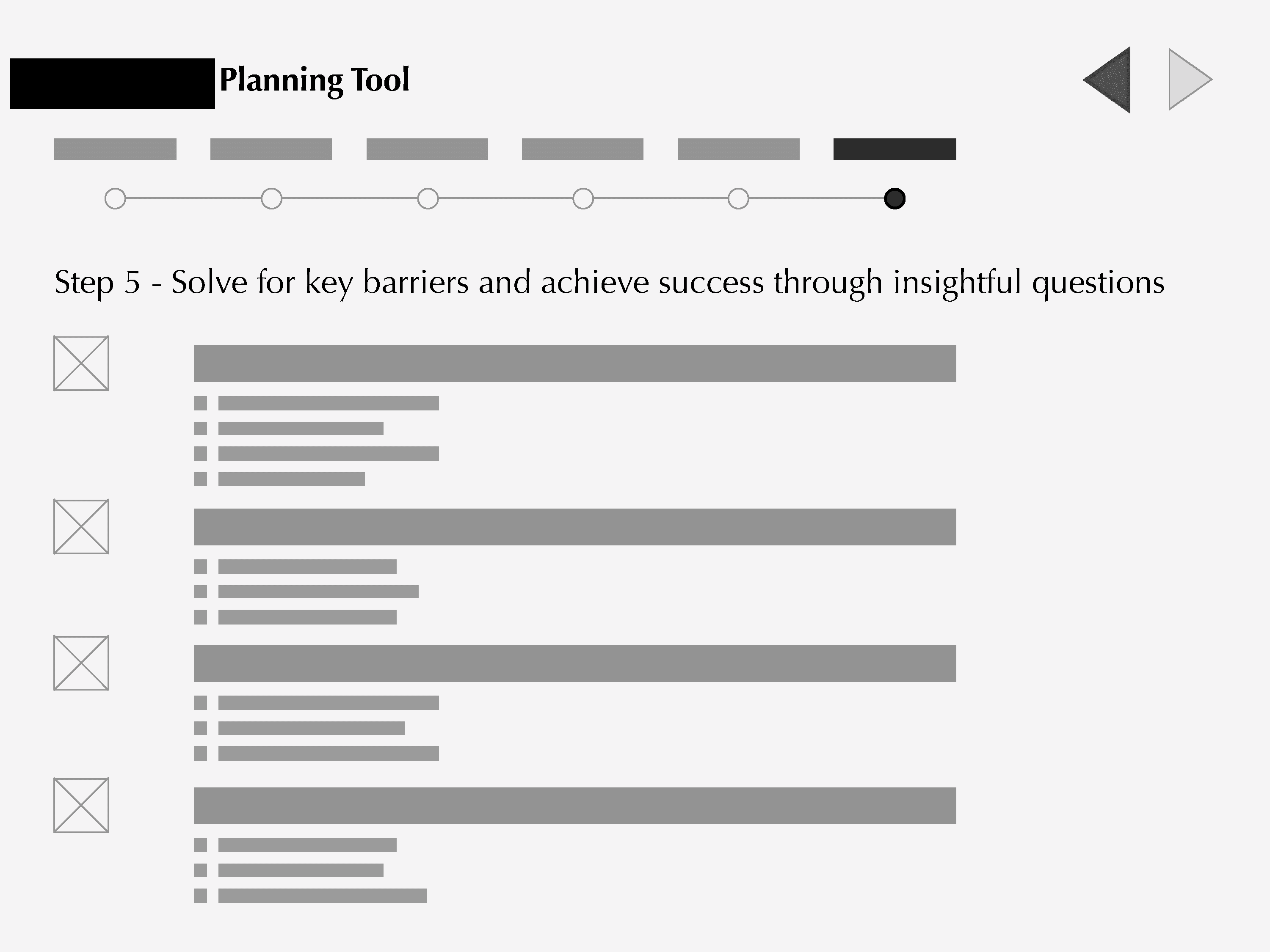
I created low-fidelity wireframes to visualize the flow and determine the placement of content.
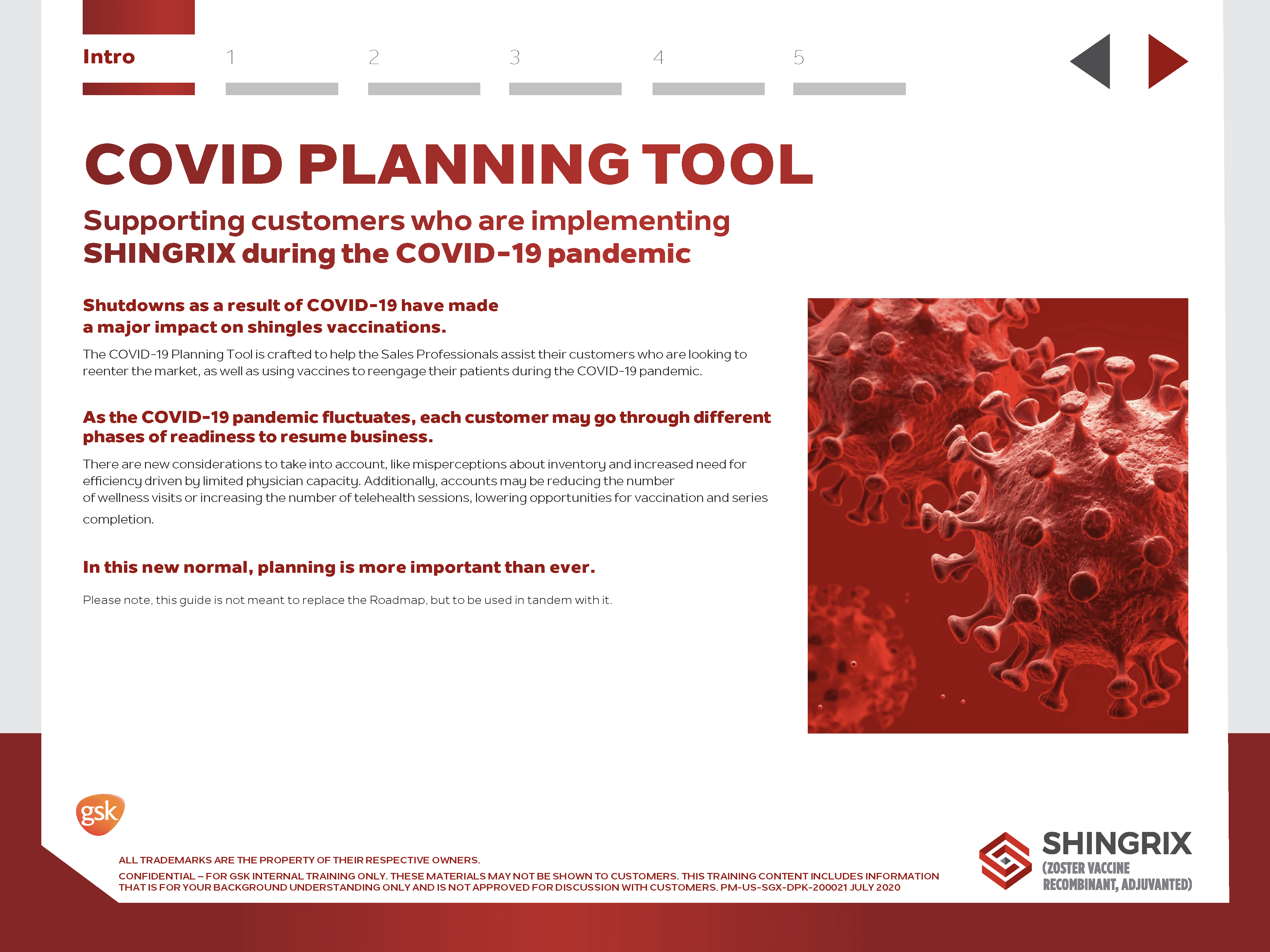
I then designed high-fidelity mockups in collaboration with the art director to ensure visual and brand consistency.
Designing experiences for Virtual Booths
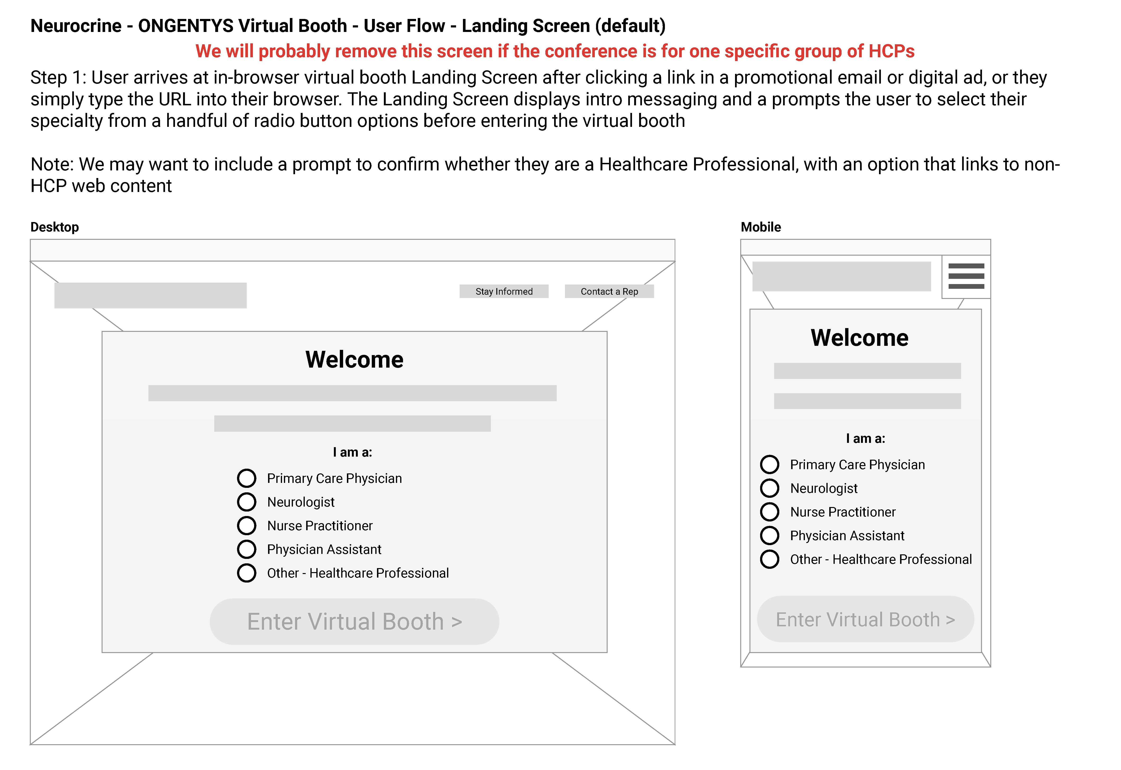
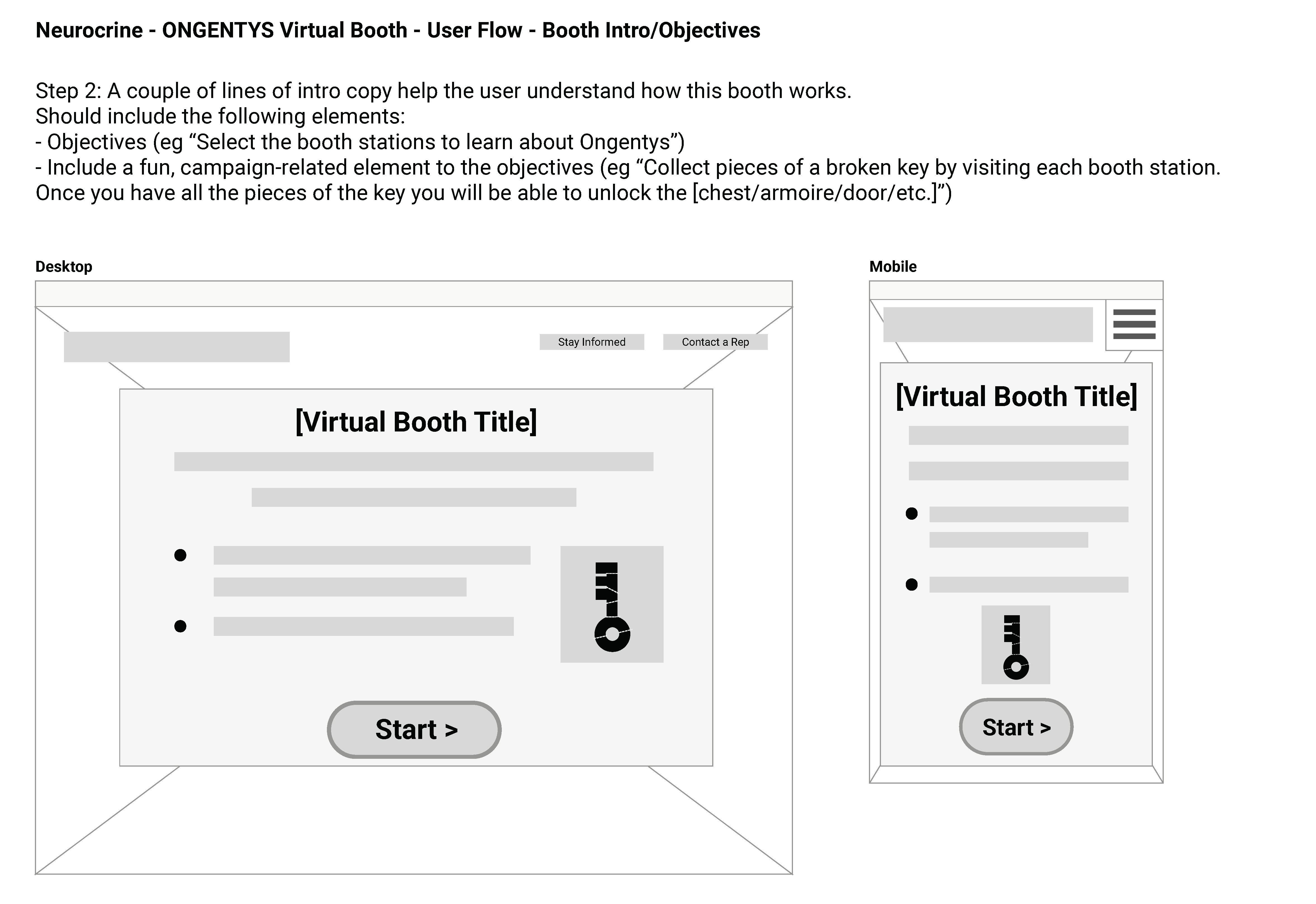
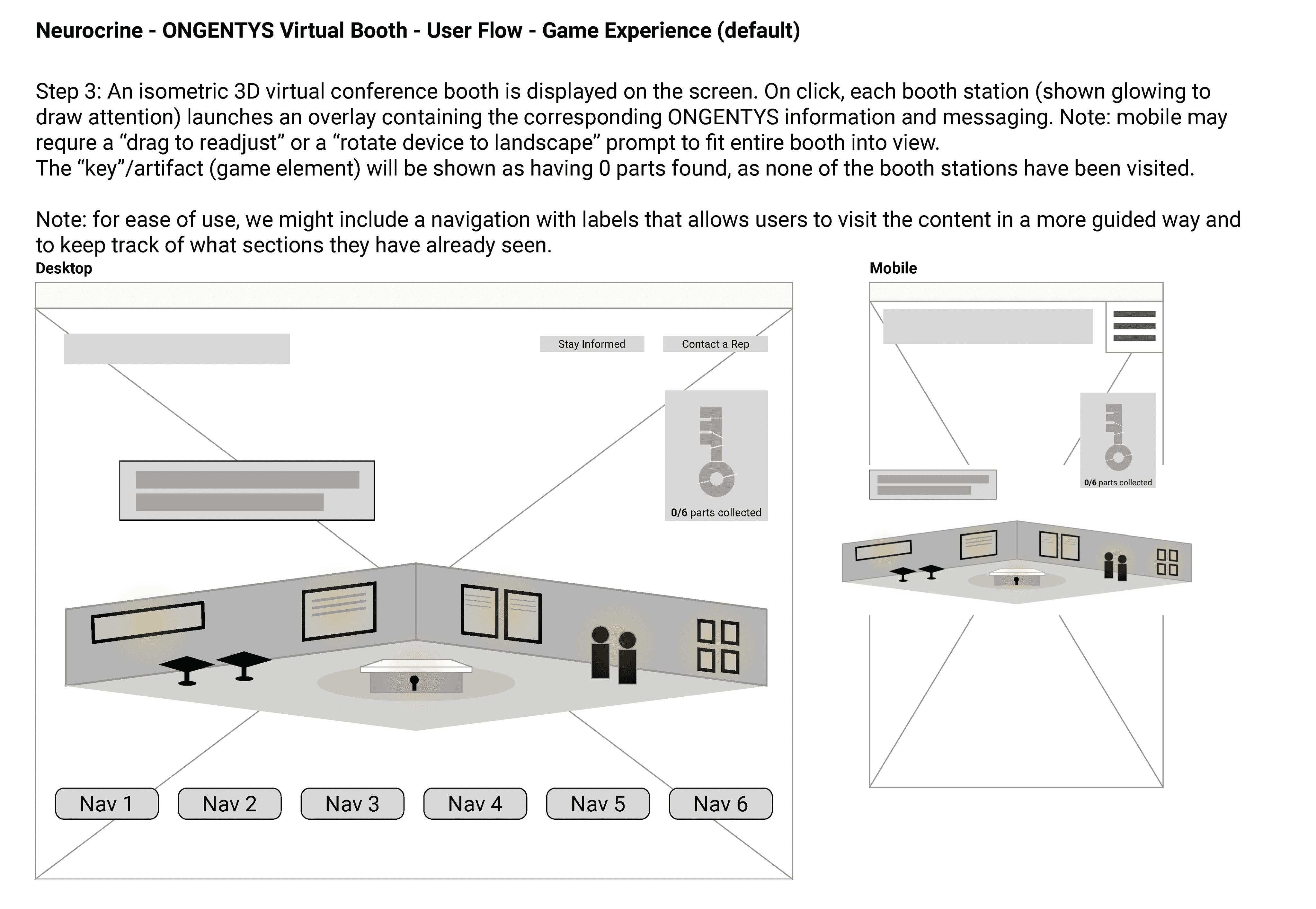
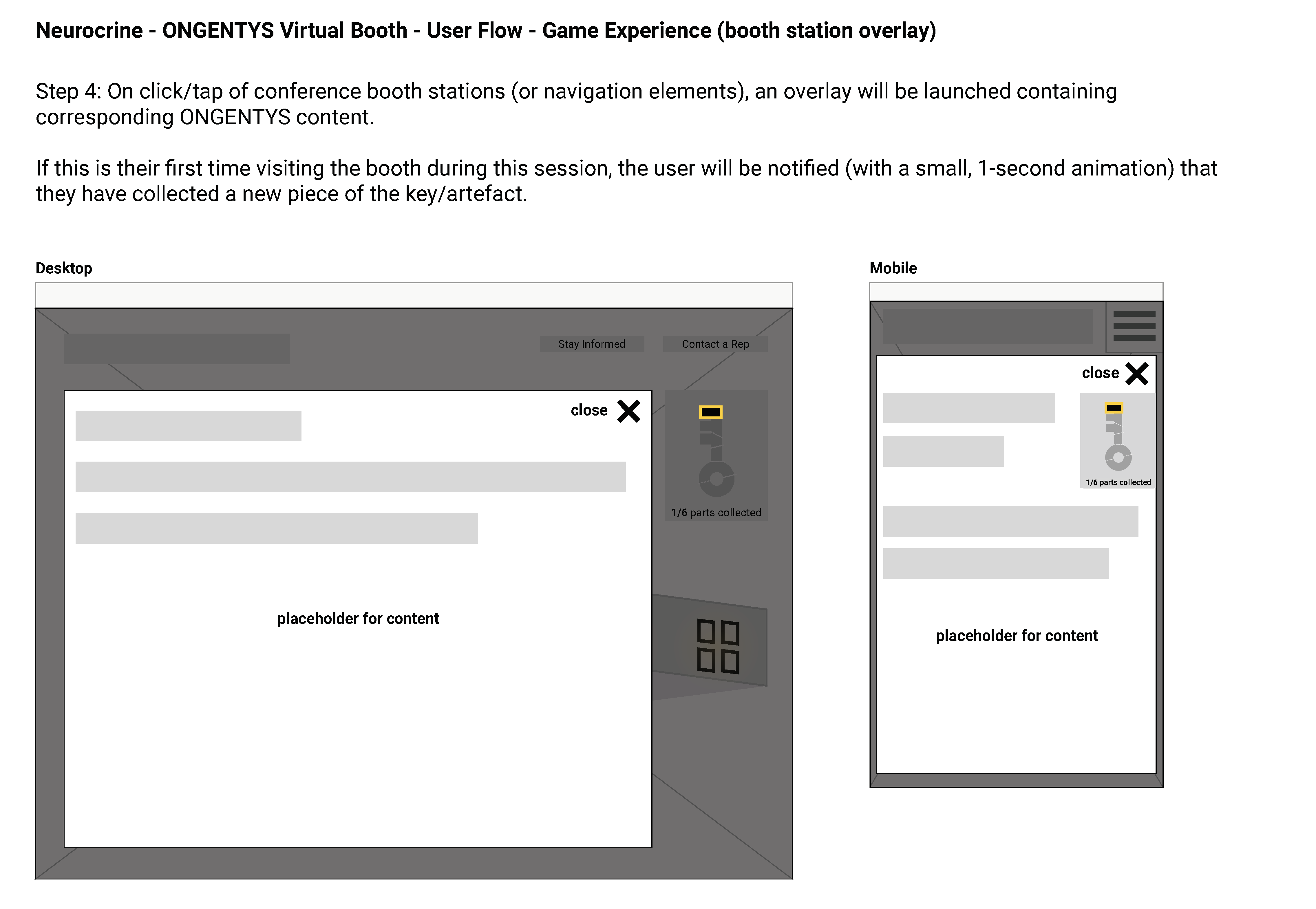
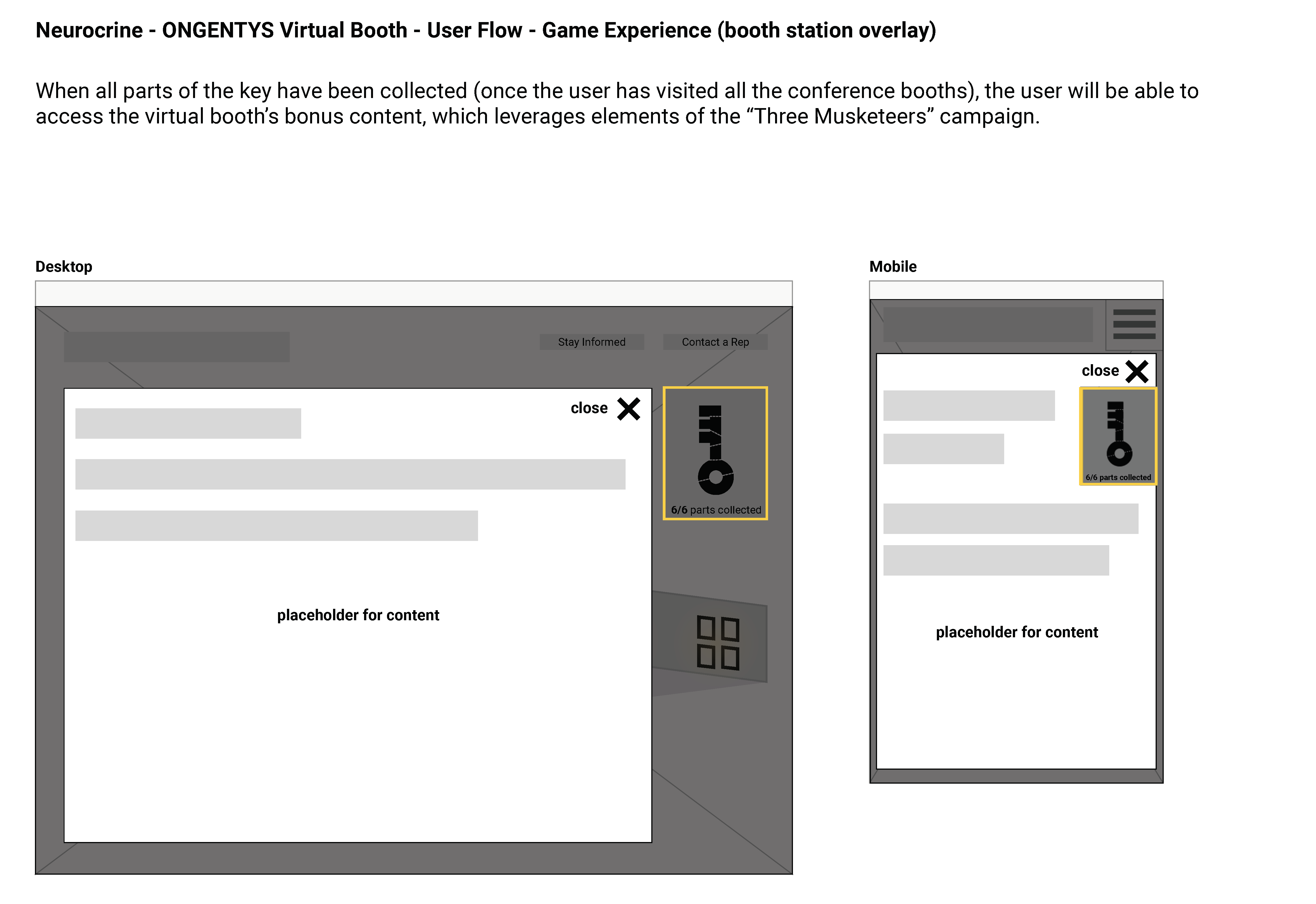
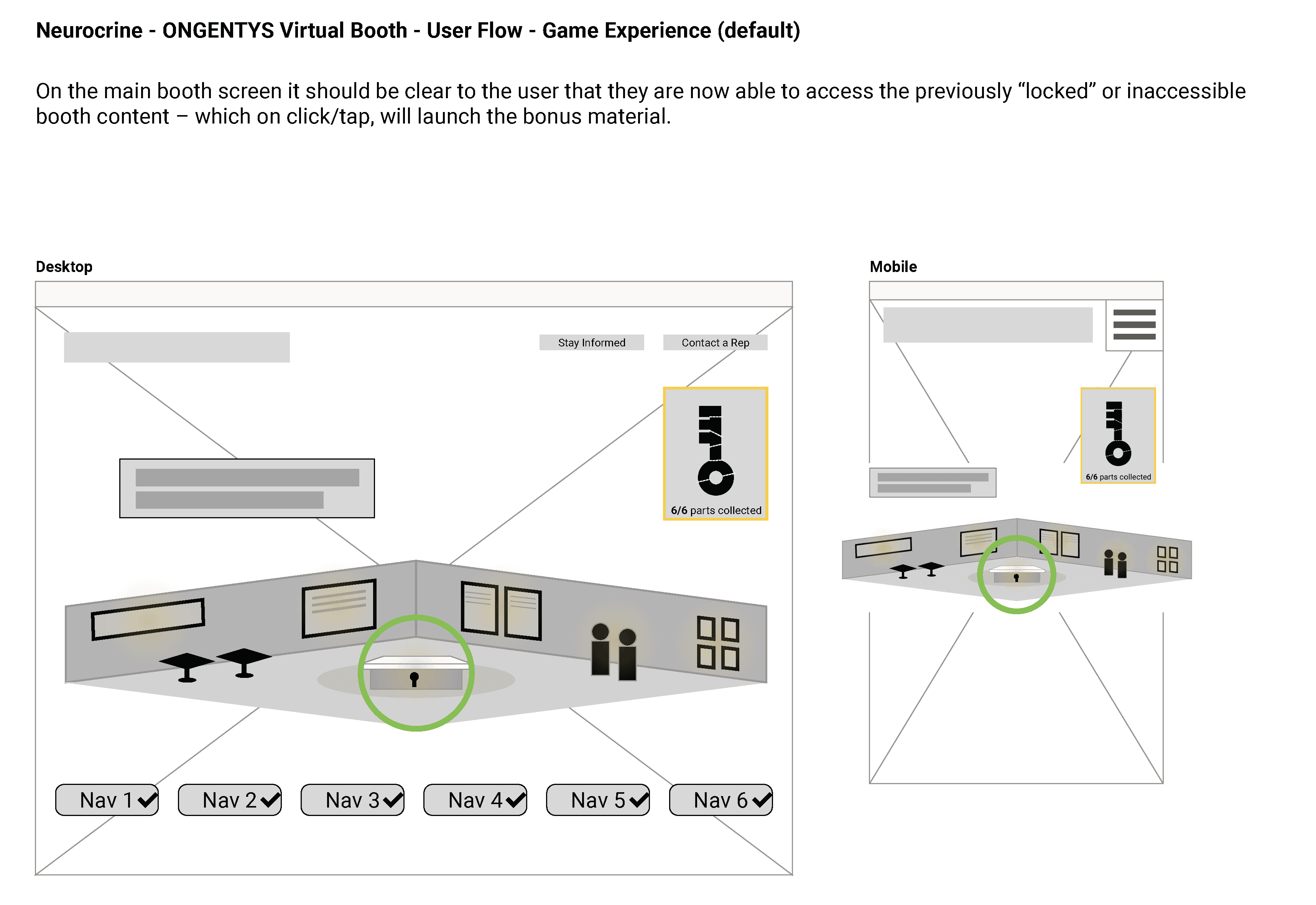
My role involved providing UX recommendations for the placement of elements on Virtual Booths to ensure a seamless experience. I collaborated closely with developers and animators to create the virtual experience, making it crucial to document the intended flow. To achieve this, I created user flow diagrams to visualize the interactions and align all stakeholders with the project objectives.
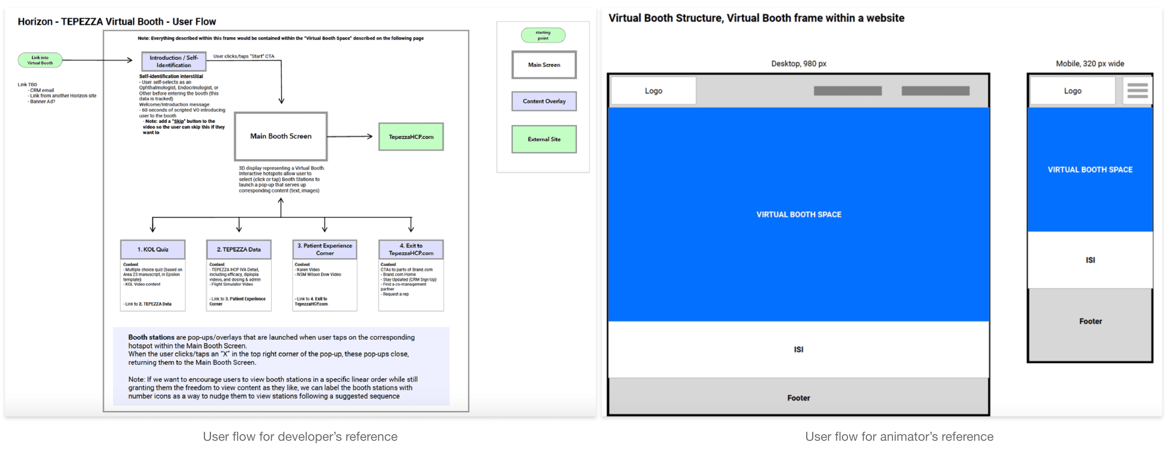
Here’s an example of the user flow diagrams I created for Tepezza. This is typically how they look.
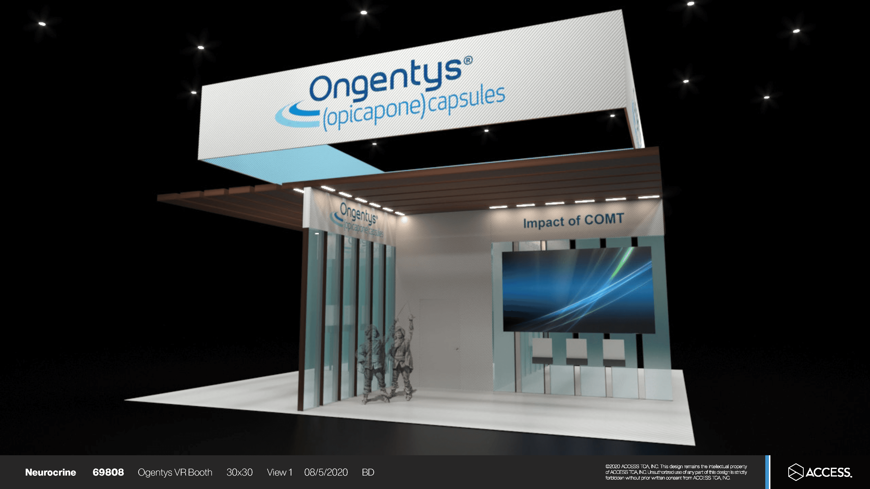
I aligned with developers and animators to create early concept flow mockups, ensuring a clear representation of the intended user interactions.
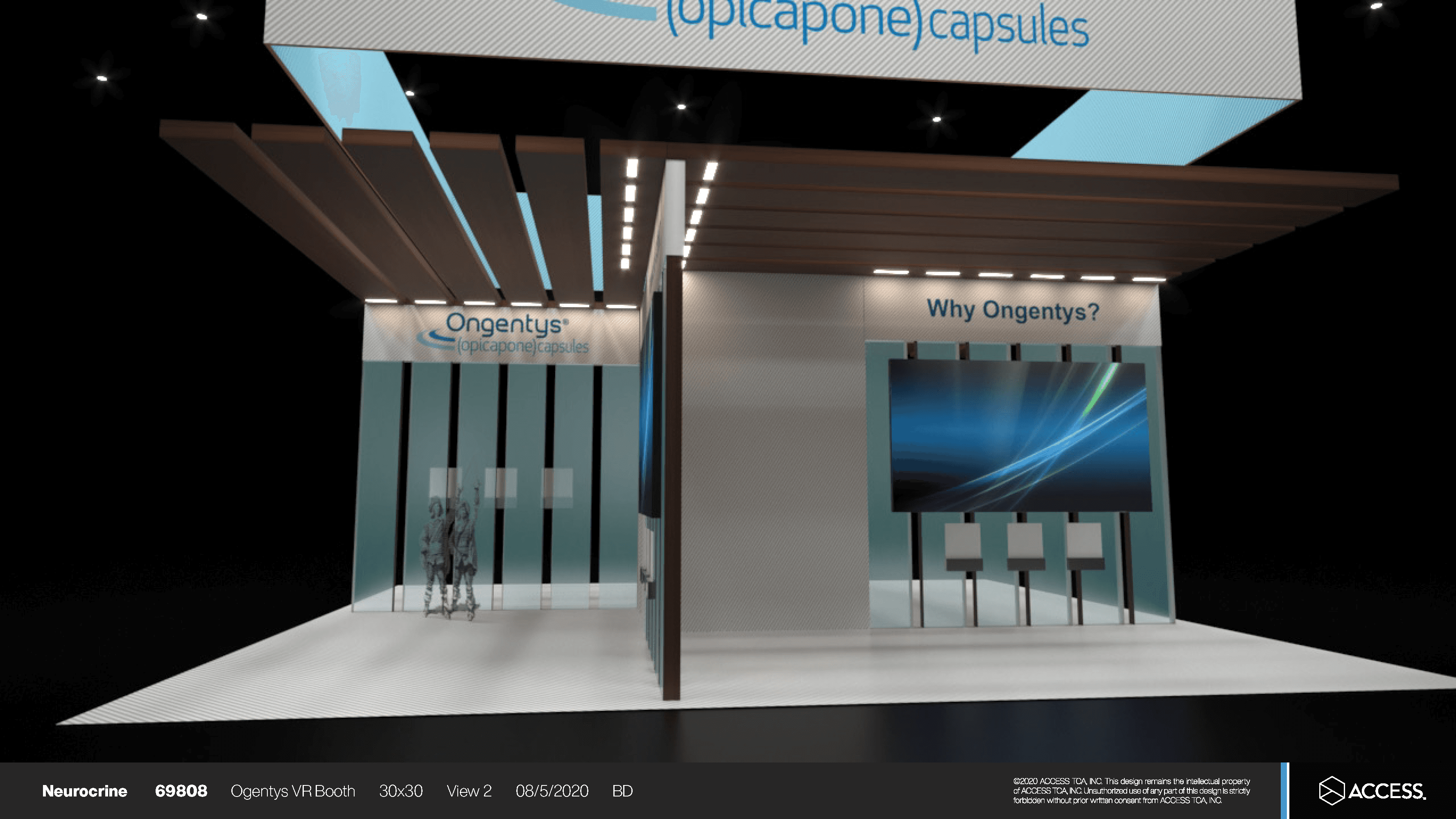
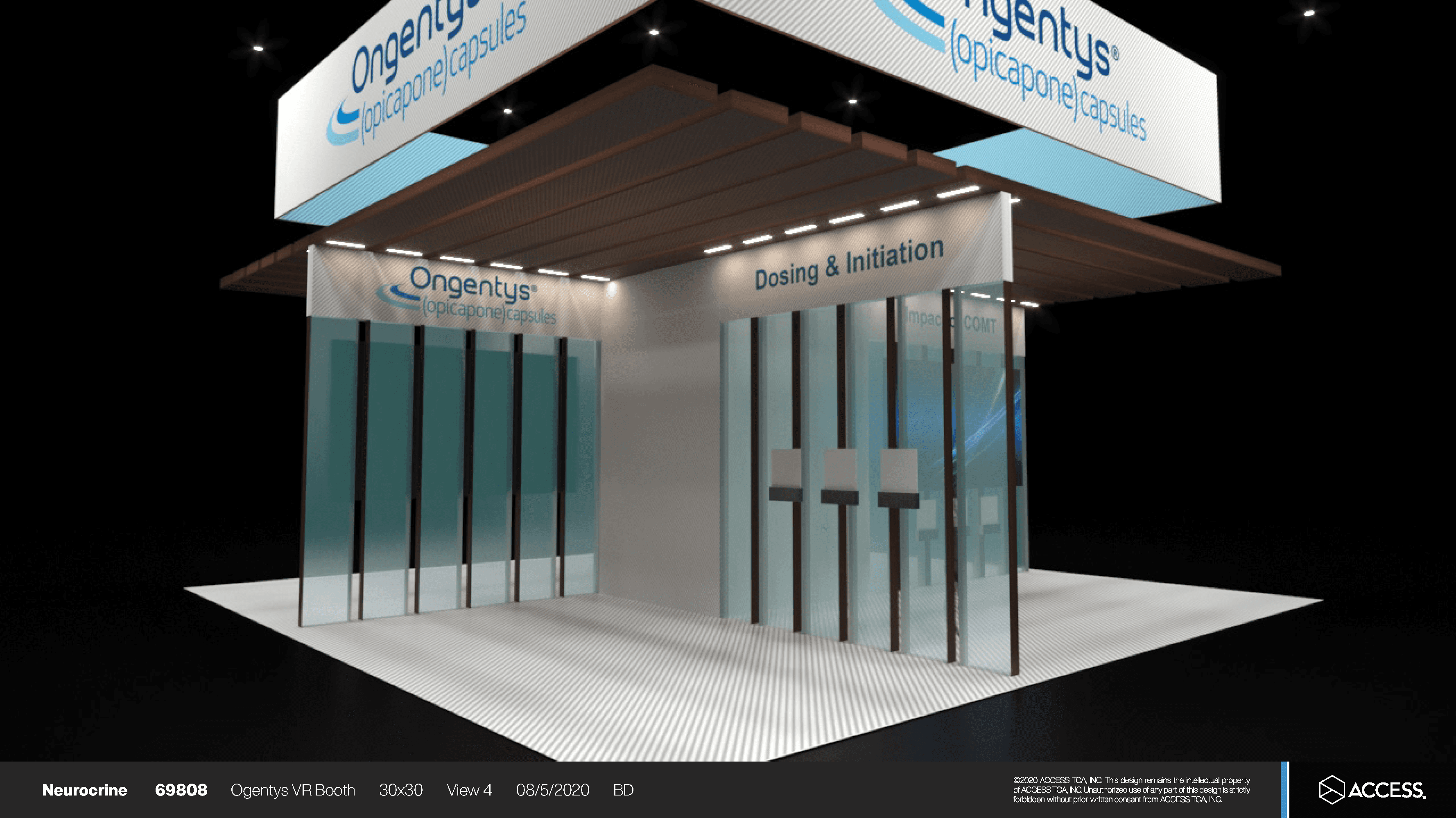
The animators would create versions of the renderings, which I would review and conduct QA on to ensure an optimal user experience.
Early renderings of Ongentys
Once the final version of the rendering is ready, following extensive QA, we present it to our client.
Designing experiences for Interactive Visual Aids (IVAs)
The client typically supplies the content for the Interactive Visual Aids. My role is to ensure the information about the product is presented clearly and is easy to navigate. I focused on designing an experience that provides an intuitive, high-level overview of the product, ensuring users can quickly understand key details.

Here’s an example of the user flow diagrams I created for Tepezza. This is typically how they look.
I begin by creating content maps for both the IVAs and landing page, which I review with clients and stakeholders to ensure alignment and clarity.

Here’s an example of the content maps I create for IVAs. I created this for Alkindi Sprinkle
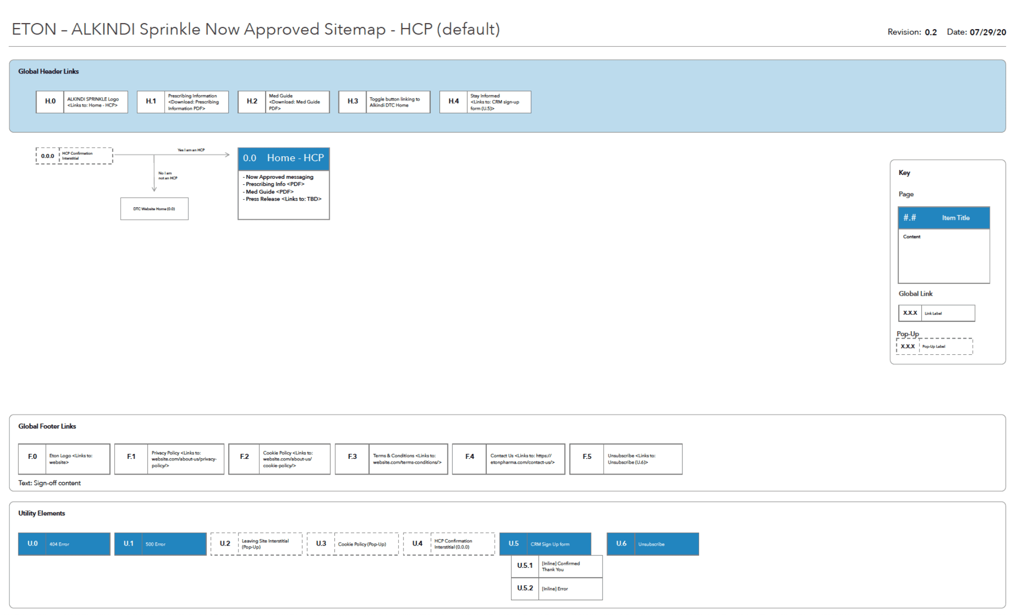
Here’s an example of the content maps I create for landing pages. I created this for Alkindi Sprinkle.
I then create wireframes to establish the layout, structure, and hierarchy of the content, ensuring the design supports both user needs and business goals.
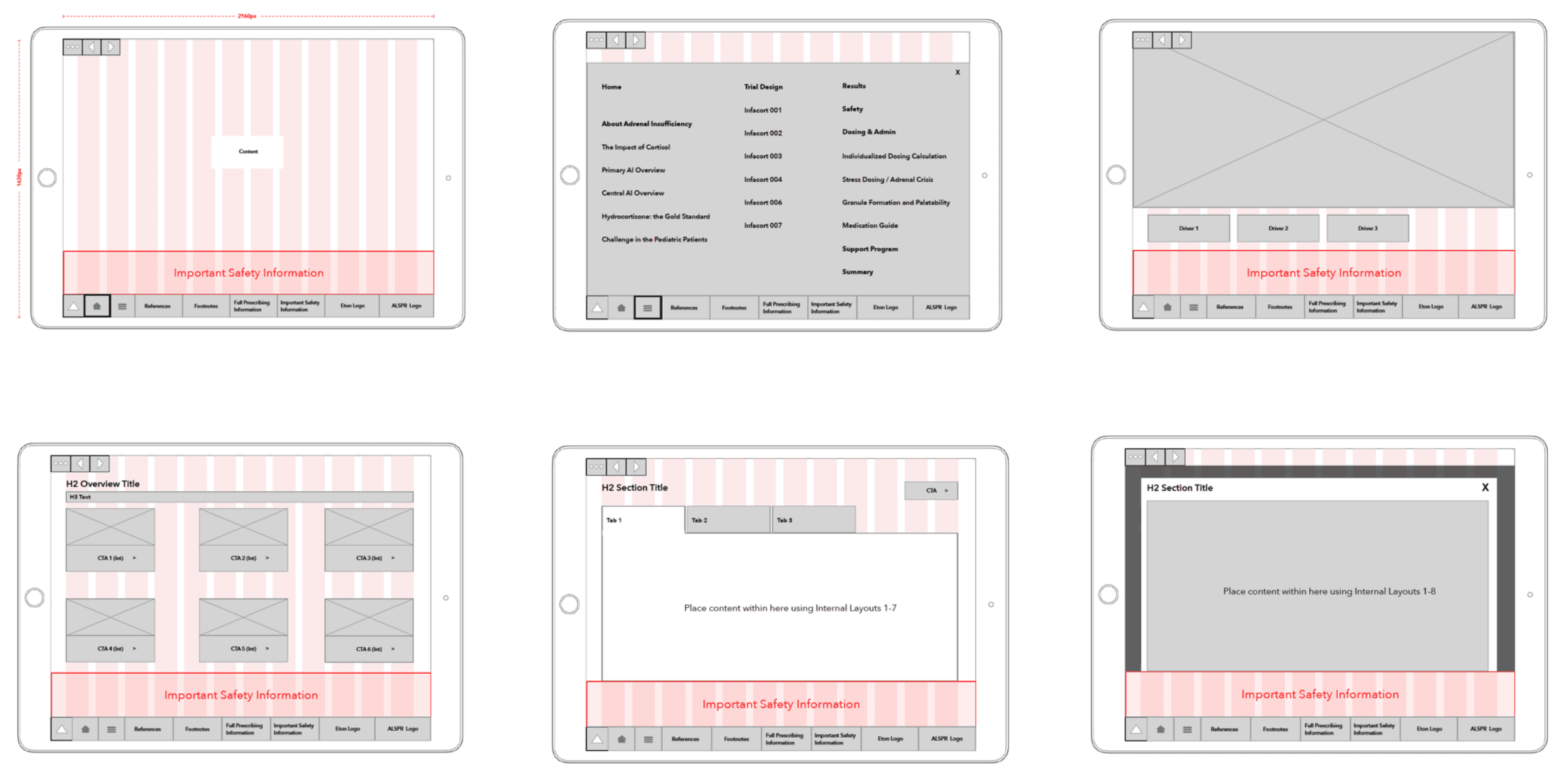
Wireframes for IVAs
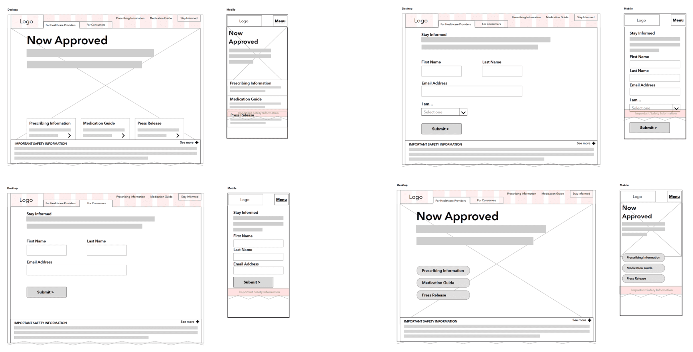
Wireframes for landing pages
Once the wireframes are finalized and aligned with the stakeholders, I collaborate closely with Art Directors to refine the visuals, ensuring brand consistency and aesthetic appeal. After incorporating feedback and making necessary adjustments, the design is handed off to developers. I continue to work with the team through QA to ensure the final product aligns with the intended user experience. Finally, the polished solution is presented to the client for approval and implementation.
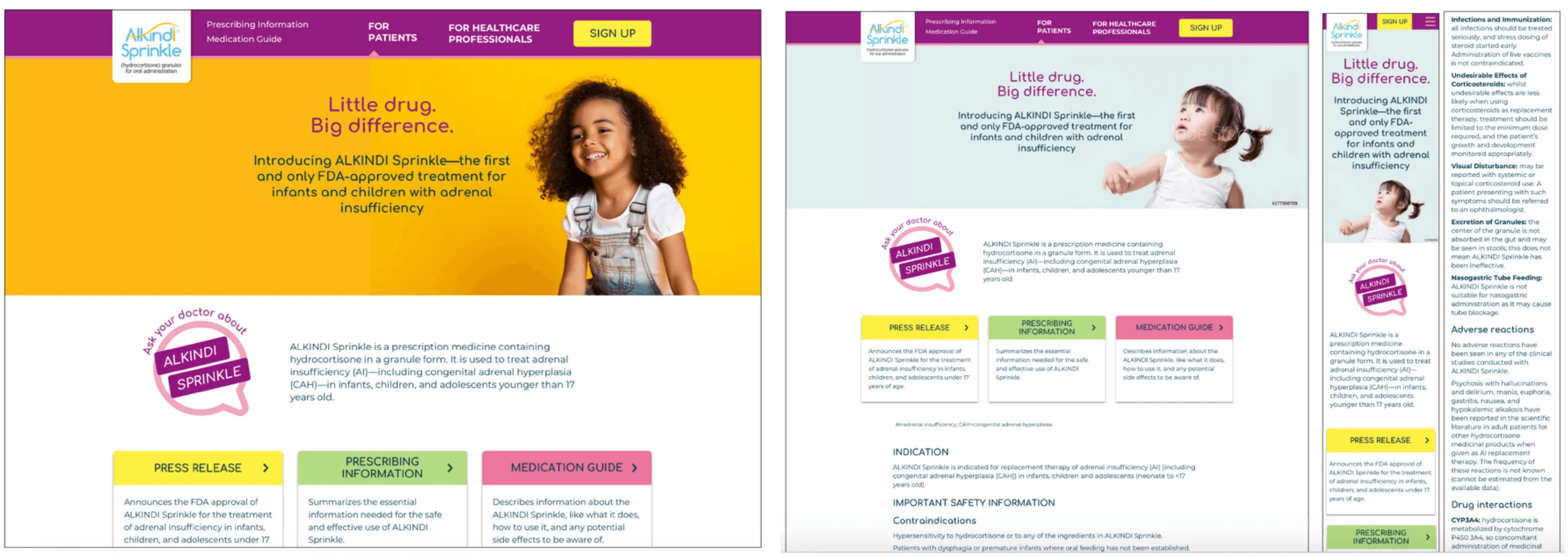
Here’s our landing page for Alkindi Sprinkle, which you can view at www.alkindisprinkle.com. While the imagery has changed since this update, the information architecture remains the same.
