YipitData
Investor Platform Design
Context
YipitData is a fast-growing leader in alternative data, transforming non-traditional data sources into actionable insights for institutional investors and businesses. In 2021, the company secured a $475 million investment from Carlyle Group, solidifying its position as a market leader.
At the time, YipitData’s service was delivered primarily via email, which posed security risks and showed early signs of potential data sharing concerns. I was hired to address this challenge by incentivizing customers to adopt the Investor Platform, enabling them to securely access reports and dashboards through a streamlined web platform.
What did I do?
I led the end-to-end design process to transition YipitData's service from an email-based content delivery system to a web platform, building the user experience from 0 to 1.
Understanding our customers
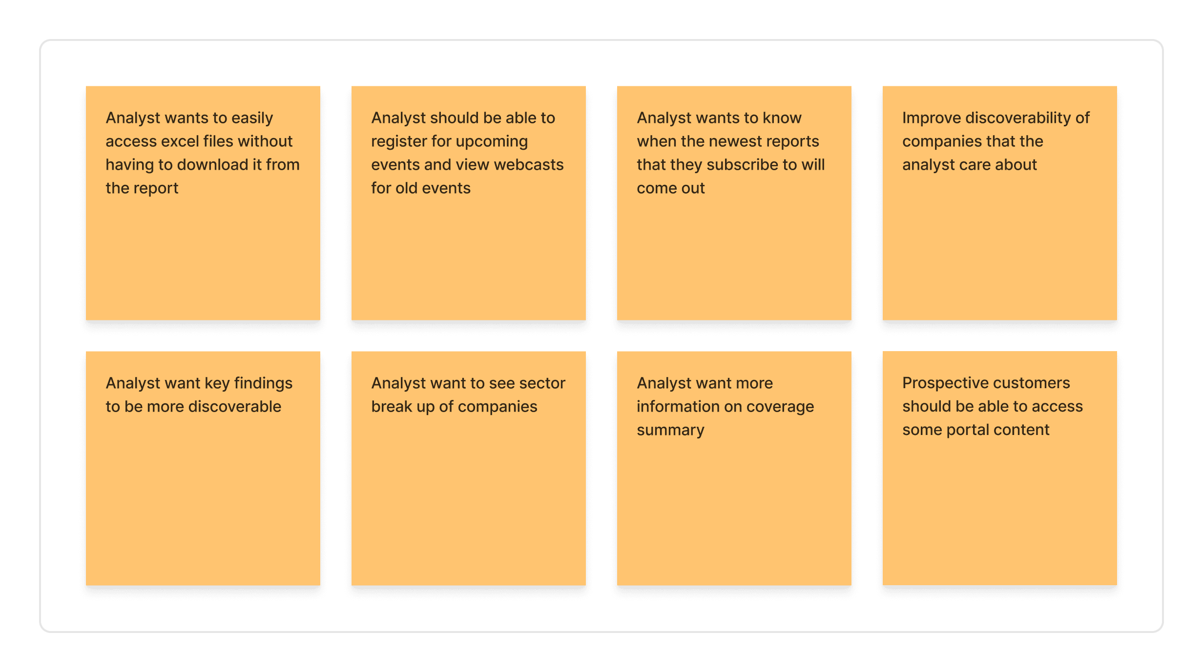
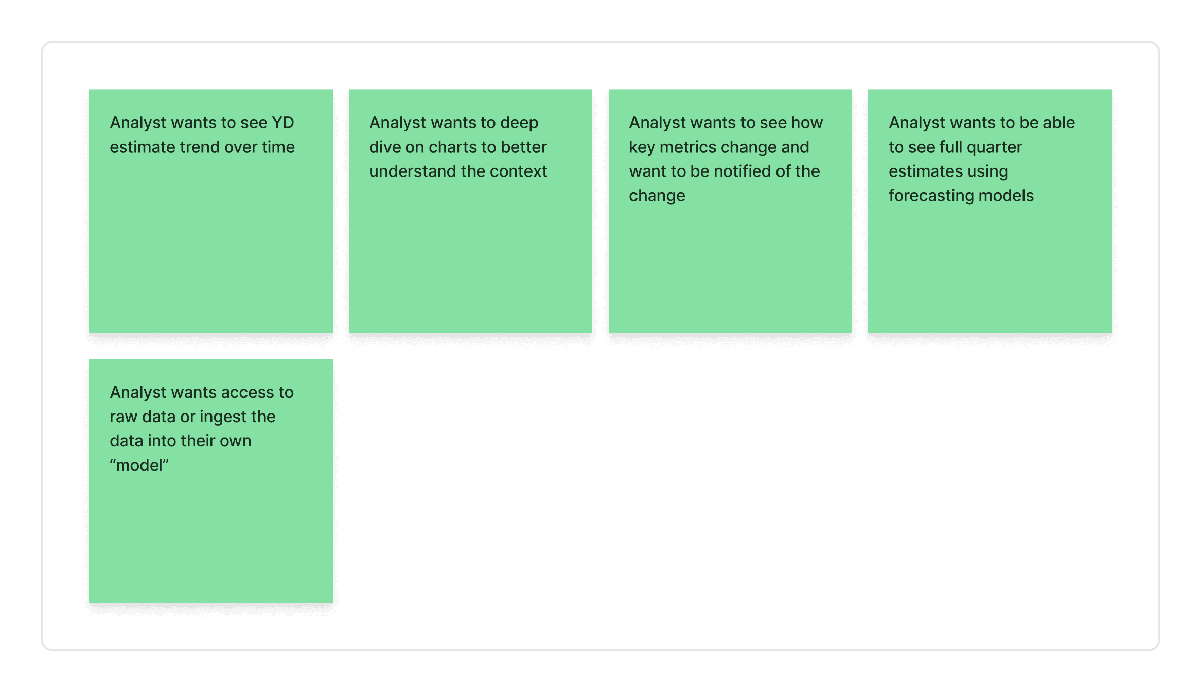
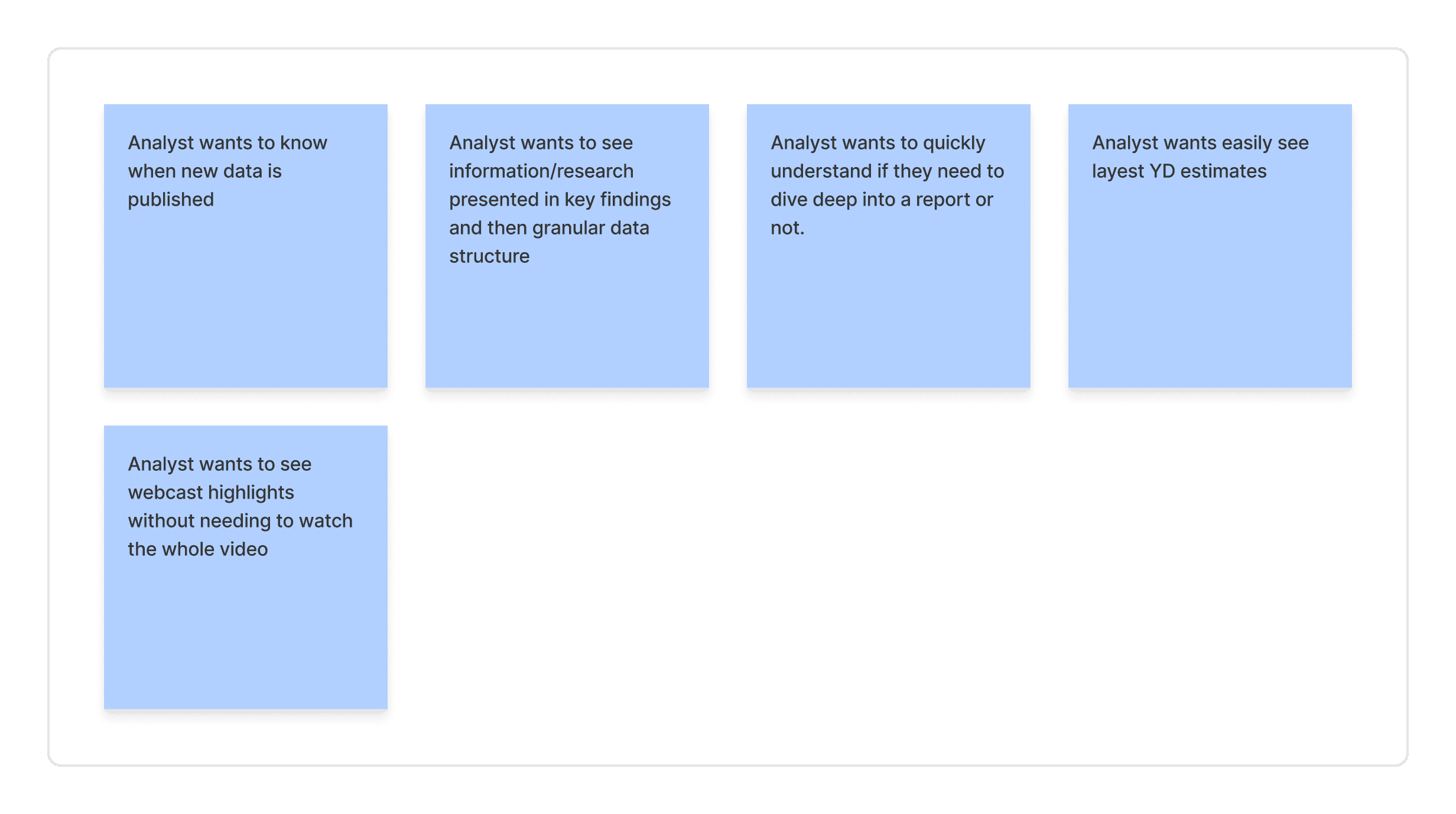
Design and Product had little precedent for engaging with customers directly. Recognizing the importance of real user feedback, I spent three months reviewing recorded calls, identifying pain points, and collaborating with my PM to map insights. We worked with revenue teams to connect with customers and gather direct insights, creating research artifacts like Affinity Maps and User Flow diagrams to ensure our designs were always aligned with customer needs.
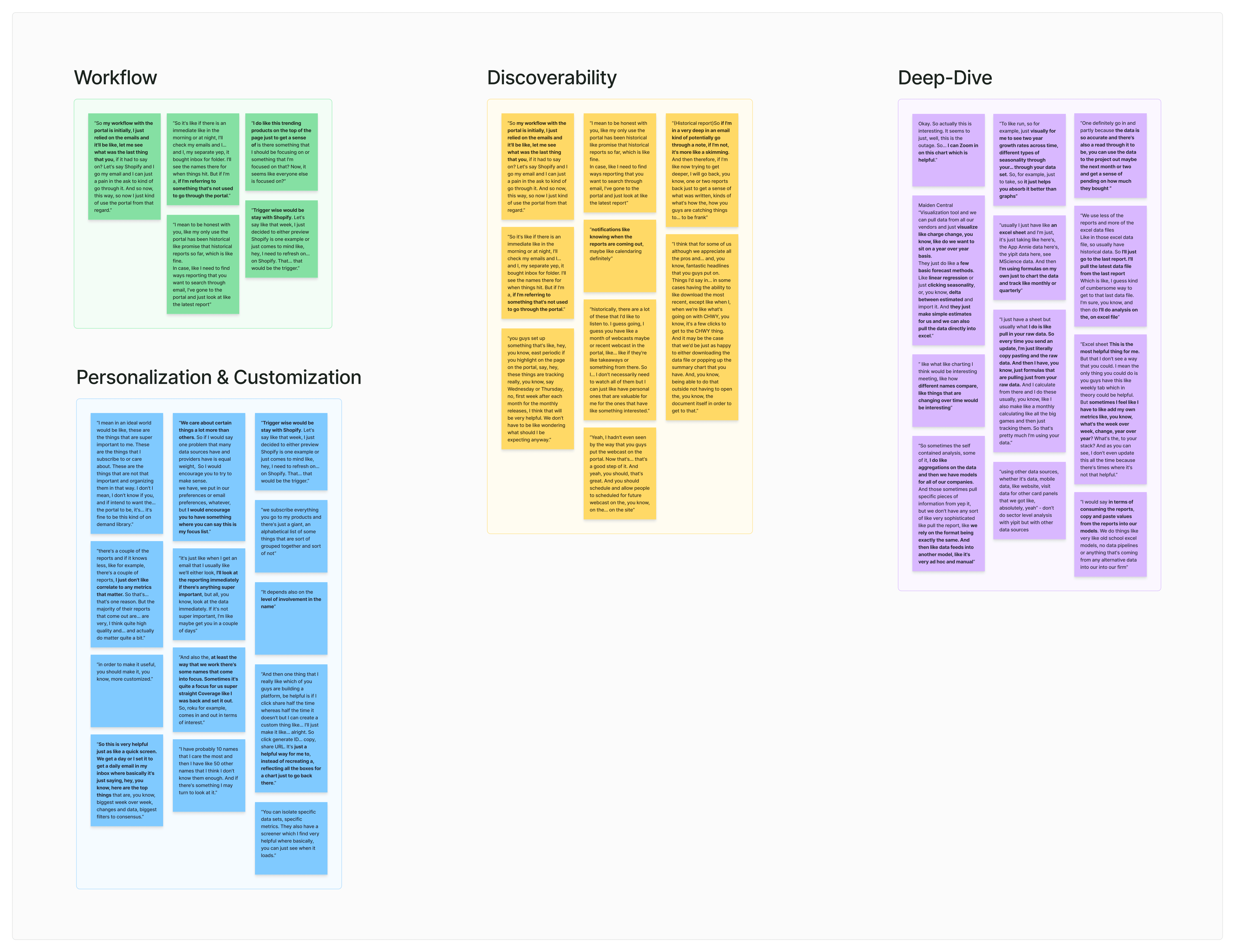
One of the many affinity diagrams I created to better understand our customers
Designing user workflow diagrams
Defining problems to solve
Discoverability of Existing Content
How might we make it easy for customers to quickly find the content they are looking for?
Ability to Deep-Dive
How might we empower our users to do their own deep dive analysis from our platform and data offerings?
Personalization & Customization
How might we make it easy for customers to focus on what matters to them most?
Streamlining Updates and Preserving Context
How might we quickly update customers on new changes and enable seamless transitions from key findings to deep dives, preserving their context?
Creating the Design System
One of the main challenges during implementation was how the components functioned. Since our engineers used MUI, the default values didn’t fully align with my design vision—specifically, the colors were too bright, and the interactions relied more on clicks, whereas I wanted to emphasize hover interactions. To resolve this, we redefined certain components and their behavior to better align with my designs, minimizing the need for repetitive annotations during handoff.
We developed our own filter component
Evolving the Platform Experience
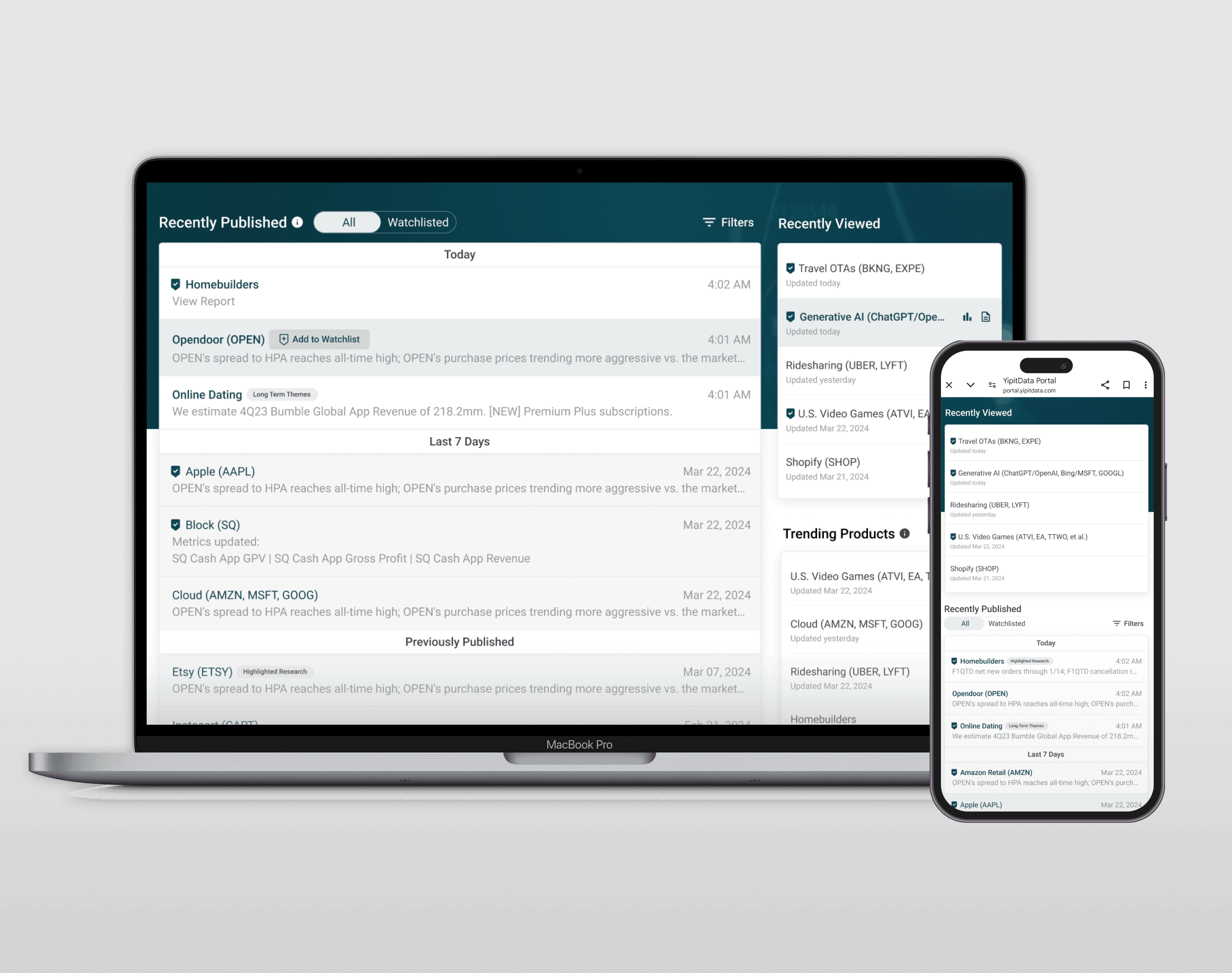
By leveraging my understanding of our customers and collaborating closely with PMs and engineers, I was able to significantly improve how customers engaged with the platform. This included designing a seamless web experience that elevated their interaction with YipitData, offering a professional and modern interface.
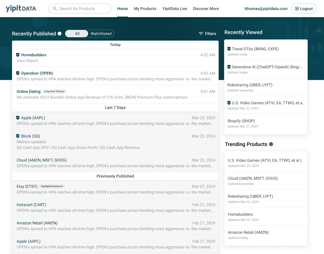
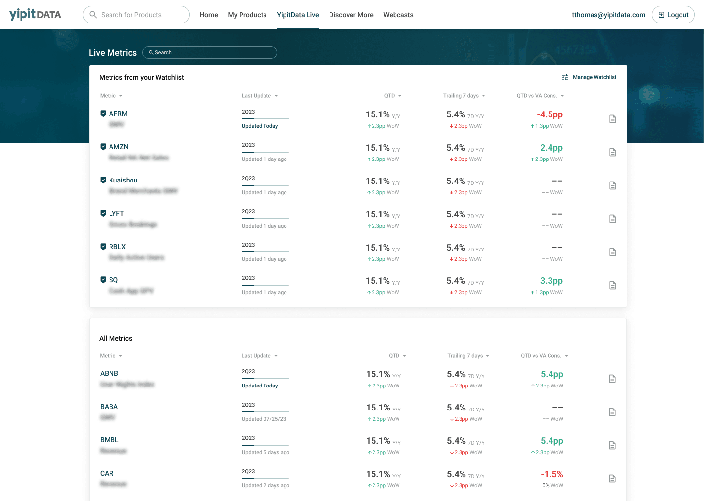
Our customers were thrilled with the key metrics screener, as it allowed them to effortlessly track essential KPIs for the companies they cared about. This feature led to an impressive 73% week-over-week retention rate.
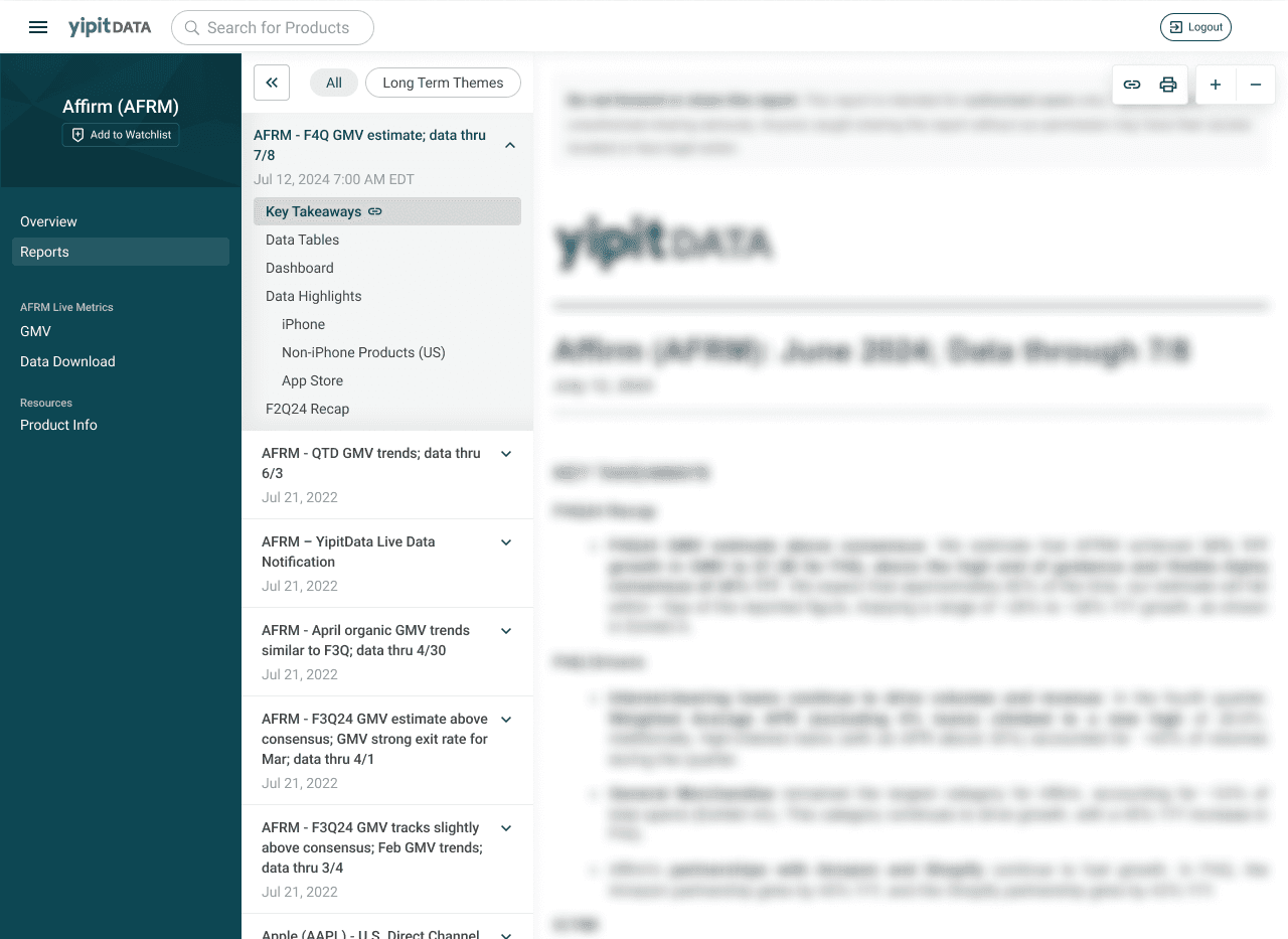
I also improved the report reading experience on the platform. Previously, customers—especially new ones—struggled to find key content within a report. The new design introduced features like report outlines, adaptive zoom and the ability to share links to specific sections with peers in their organization, making it a more intuitive and collaborative experience.
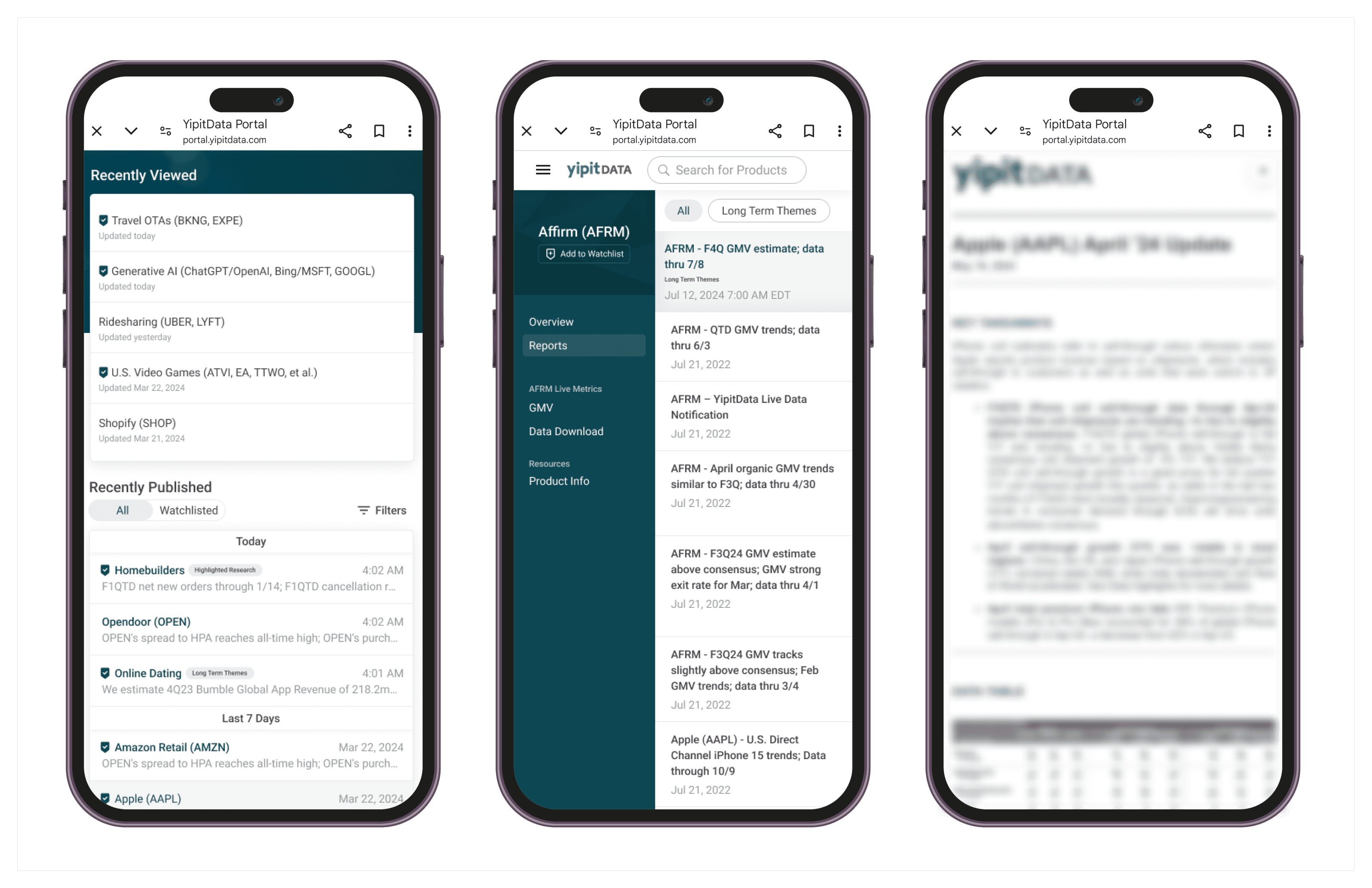
I worked closely with engineers to design a responsive experience, ensuring the platform is mobile-friendly and optimized for customers on the go.
