YipitData
Home Page Redesign
Context
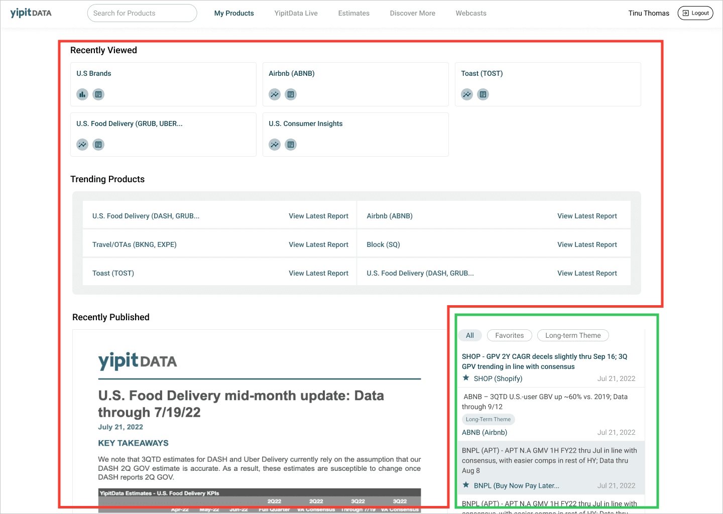
The platform homepage wasn’t effectively showcasing newly published reports for relevant products, even though customers visited daily to access the latest insights. Over 70% of the homepage was dedicated to irrelevant content, making it difficult for them to quickly find what they needed.
Here’s a snapshot of the original design. Customers often struggled to find the reports they cared about since they were tucked away in a small list in the right corner of the screen.
What did I do?
I revamped the investor platform homepage to enhance report discoverability and enable our customers to find content for companies they care about easily.
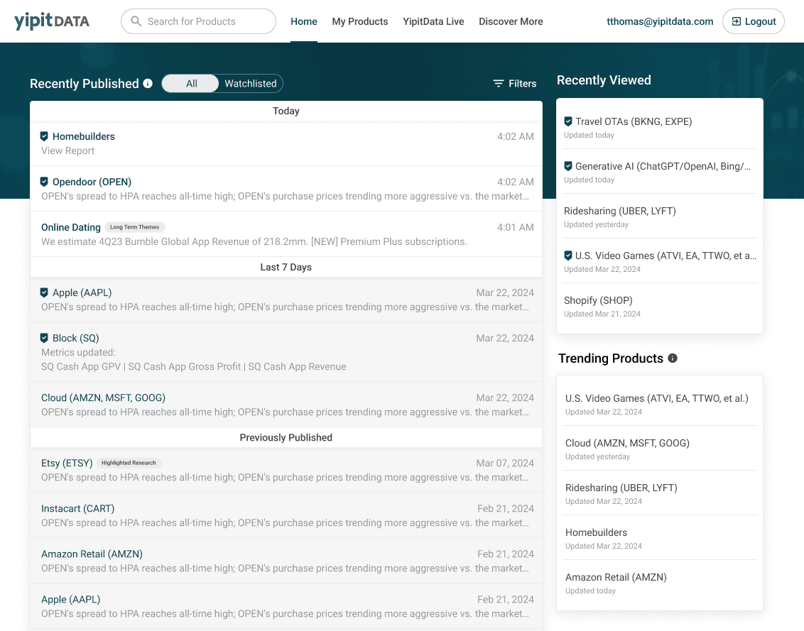
I designed a two-column homepage layout, prioritizing reports on the left and relocating 'Recently Viewed' and 'Trending Products' to the right.

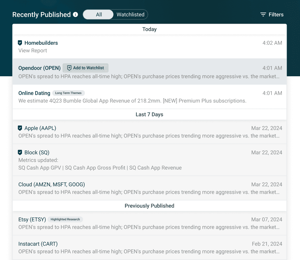
To enhance how customers find relevant reports, I added headers like 'Today' and 'Last 7 days' to help them easily scan from the latest to oldest reports. I also introduced hover-triggered watchlisting actions, simplifying the process of updating preferences directly from the homepage.

Anatomy of the report inside the grid.

Designed a sticky header for 'Recently Published' to keep 'Today,' 'Last 7 Days,' and 'Previously Published' visible during scrolling so that customers are aware of the age of the reports they're looking at, enhancing usability.

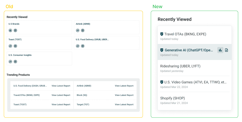
I redesigned 'Recently Viewed' and 'Trending Products' by transforming them into a new card layout. Each card featured rows displaying the latest publication dates and quick action buttons for easy navigation. This design not only optimized space but also enhanced usability and engagement.


